If there’s one thing I love about a new season, it’s the colour reset it brings.
Nothing signals spring quite like a shift in palette—those first glimpses of brightness after a long, grey winter. Colour sets the mood, and for Spring 2025, the message is clear: optimism is in, but with a grown-up edge.
We’re seeing people lean into pastels again—but not in the sugary, saccharine way. It’s about pairing softness with depth. Candy pink with ivy green. Butter yellow with navy. Think less harmony, more contrast.
The return of yellow isn’t a coincidence. After a stretch of anxiety and economic tension, yellow offers lightness. It’s linked to clarity and optimism—two things we’re all chasing. The same goes for powder blue and pale pink. These tones calm the noise. But paired with deeper hues like ivy green and navy, they feel more intentional than innocent.
Here are the colour combinations setting the tone this season:
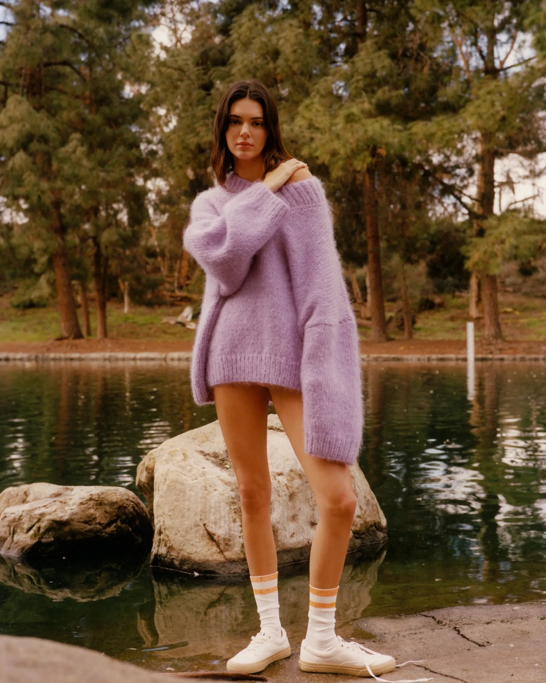
Butter Yellow + Navy
We’re seeing more yellow because we need it. This sunny shade is linked to optimism and clarity—two things people are chasing. Paired with navy, it becomes polished. Clean, minimal, and effortlessly chic.

Candy Pink + Ivy Green
The sweet-and-sour combo. Pink taps into our sense of play; green keeps it grounded—a colour story that’s romantic without losing its cool.

Pastel Yellow + Red
Bolder than it sounds. Pastel yellow smooths the intensity of red, making the look more playful than powerful. It’s a palette that speaks to duality—joyful yet strong.

Deep Purple + Grey
There’s something undeniably luxurious about this combination. Plum purple brings richness and depth, while grey keeps it grounded.

Tangerine Orange + Powder Pink
We’re drawn to orange because it signals energy and possibility. When toned down by powder pink, it reads as warm, vibrant, and optimistic. A palette that feels like a good day.

Kermit Green + Baby Blue
Loud, ironic, and Gen Z-coded. This high-contrast combo reflects a shift towards expressive dressing. It’s for the scroll-stoppers, the dopamine dressers, the mood boosters.


.svg)


.svg)
.svg)