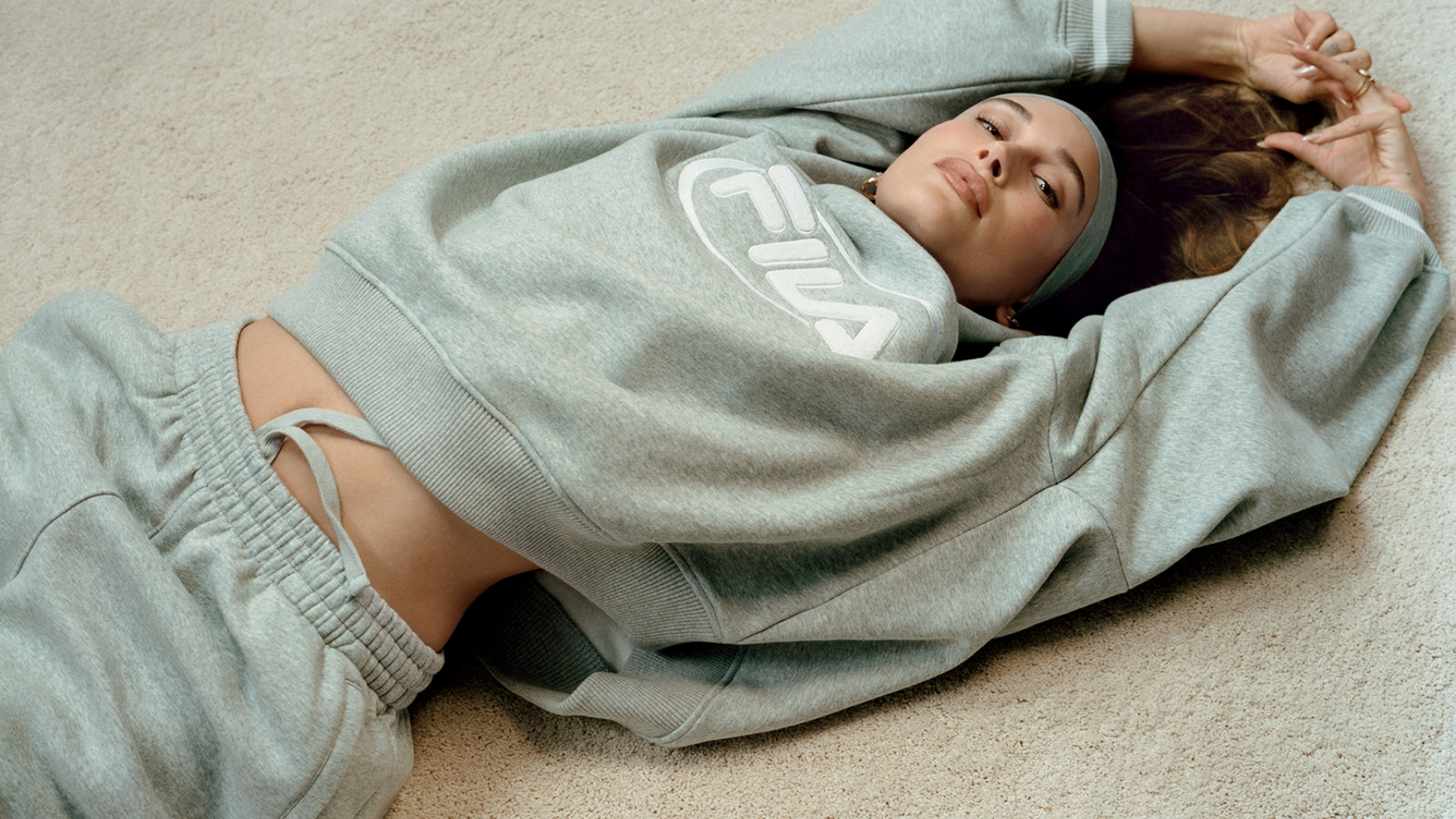
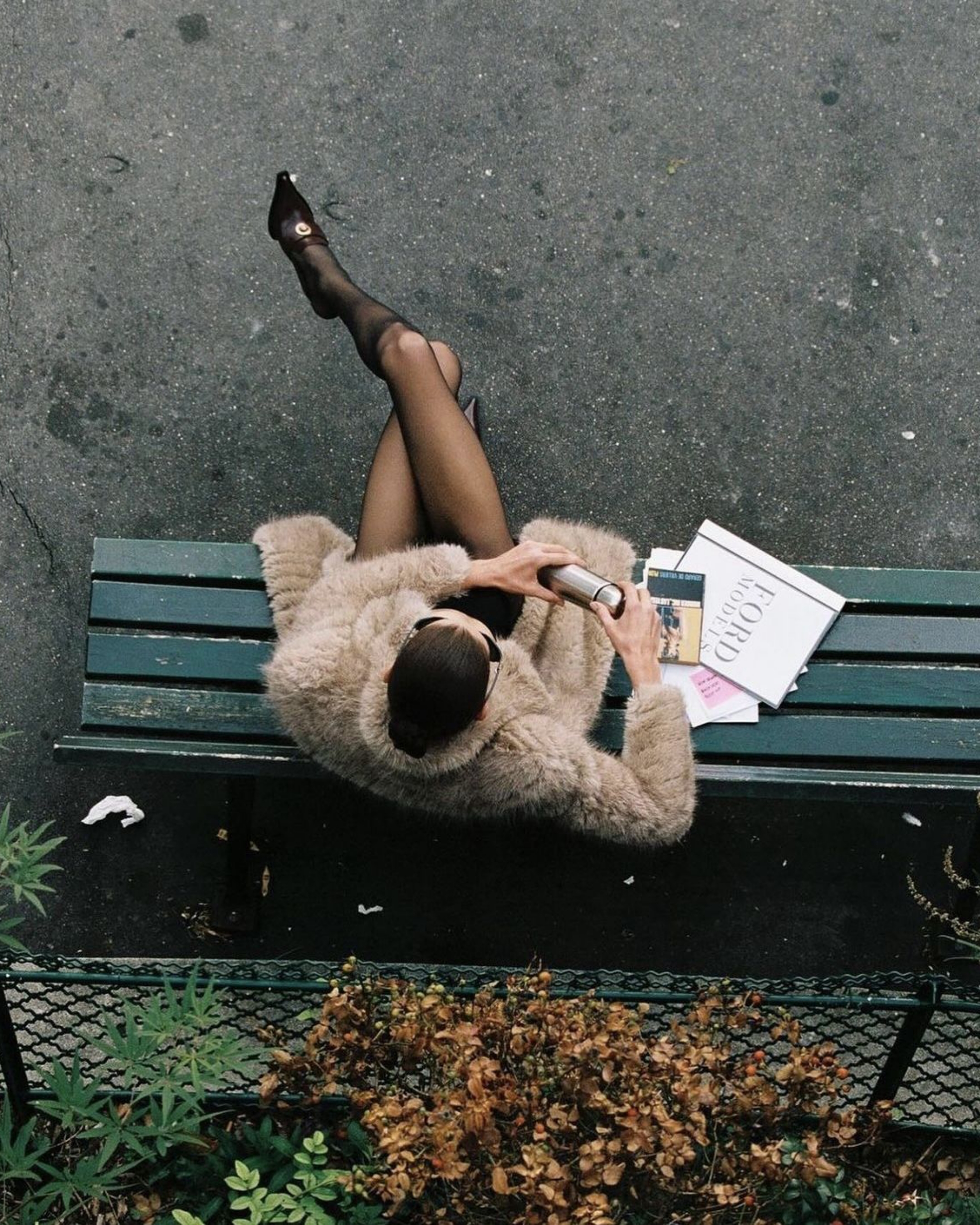
As we step into 2025, the design world is brewing up some serious creative energy. And what better way to kick things off than with Pantone’s Colour of the Year: Mocha Mousse. Sure, it sounds like a dessert special at your favourite café, but this warm, creamy brown is already being hailed as the shade we’ll be seeing everywhere—from fashion runways to living rooms.
Laurie Pressman, VP of the Pantone Color Institute, describes it as “a mellow brown hue with comforting warmth that reflects our craving for connection and simple pleasures.” Translation? It’s beige’s chic older sibling: cosy, indulgent, and a little luxurious. Personally, I think it’s a darker beige with a dash of cream stirred in, but let’s not split hairs. Whether you’re pairing it with crisp white or using it as a base for pops of colour, Mocha Mousse is versatile enough to make its mark without stealing the show. Like the dessert it’s named after, it works best in moderation—unless you’re going full Kitty Flanagan in Fisk.
But the 2025 design story doesn’t end with colour. Let’s dive into the trends shaping how we’ll create and experience design this year.
AI as the Creative Wingman
Artificial intelligence isn’t just lurking in the background anymore—it’s stepping up as a full-blown creative partner. OpenAI’s recent upgrade to ChatGPT Search has upped the ante, offering real-time answers and helpful links that could make search engines obsolete. (Adios, Google?) For designers, this means faster idea generation, better audience insights, and plenty of room to focus on the stuff AI can’t do: adding heart, flair, and a human touch.

“We’ve stopped fearing what AI might do to creativity and started figuring out how to work with it,” says Michael Freimuth. For brands, it’s a game-changer: the ability to analyse trends, experiment with concepts, and fine-tune campaigns with laser focus. AI isn’t here to take over; it’s here to help you look good.
Midimalism
For years, the design world bounced between minimalist restraint and maximalist excess. But in 2025, we’ve found a sweet spot: midimalism. Imagine clean, open spaces accented by vibrant, unexpected touches—a bold rug here, a funky lamp there. Anne Hathaway’s perfectly balanced entryway? Peak midimalism.

Chelsea Clark, an interior design expert, nails it: “Midimalism is about borrowing the sleekness of minimalism and mixing in personality through colour and pattern—but without going overboard.” For brands, this could mean modern logos with playful details or clean web layouts with pops of bold, memorable design. It’s all about balance—enough personality to stand out, but not so much that it overwhelms.
Fonts with Feeling
If you think fonts are just a functional afterthought, think again. Typography is taking centre stage in 2025, with designers creating typefaces that feel as much as they function. Independent foundries are booming, and brands are embracing bespoke fonts that blend nostalgia with cutting-edge creativity.

“Typography is becoming a cultural statement,” says Wix Studio, with designers using letters to reflect emotions, ideas, and identities. Whether it’s a playful retro font inspired by old postcards or a futuristic take on hand-drawn type, 2025 is all about fonts that tell a story. Expect to see more personalised typefaces that make brands feel human in a digital world.
Anti-Design: Breaking All the Rules
At the other end of the spectrum, we have anti-design, where chaos reigns supreme. Think mismatched colours, clashing patterns, and layouts that feel intentionally raw and unpolished. Charli XCX’s Brat album cover was just the beginning; anti-design is taking over everything from web design to brand logos.

“Anti-design feels like rebellion,” says Imogen-Mary Hoefkens. “It’s not just about breaking the rules; it’s about throwing them out entirely.” For brands, this means taking risks, being unapologetic, and refusing to fit into the clean, symmetrical mould of mainstream design. It’s messy, loud, and sometimes confusing—but that’s the point.
What It Means for Branding
Design in 2025 is all about contrasts. From Mocha Mousse’s comforting warmth to anti-design’s chaotic energy, there’s space for every kind of creativity. For brands, it’s a chance to experiment—balancing sleek, AI-enhanced efficiency with the handmade, rebellious spirit of anti-design.
The real takeaway? People want design that feels real. Whether it’s a perfectly balanced midimalist space or a bold typeface that tells a story, the best designs are the ones that connect emotionally. So, take a risk, mix things up, and don’t be afraid to make a little mess.


.svg)


.svg)
.svg)


