β
β
β
Simple, transparent, and aesthetically pleasing, Rhode Skin's website is a masterclass in playful yet refined design. We adore this comforting approach to digital simplicity.
β
β
β
With its retro Miami pool party vibe, Vacation Inc. offers a nostalgic and creative browsing experience.
β
β
β
There's something about the elegance of black and white that never gets old, and Bourii gets it spot on. Perfectly complemented by tasteful colour in product shots, the website's clean design and sophisticated aesthetic make it a visual pleasure.
β
β
β
Le Rub stands out with its minimal, beachy vibe, enriched by interactive elements like the moving gradient background.
β
β
β
β
βThe number one goal of a website is to keep users engaged, and Eadem ticks all the boxes with its stunning use of color, unique layout, and scroll effects. The synergy of vivid imagery and dynamic design creates a standout site that's not just fun to explore but a visual journey in itself.
β
β
β
β
β
With its editorial-style and immersive imagery that fills the screen Magda Butrym exudes luxury and style with a clean layout that makes scrolling through an endless delight.
β
β
β
Coucoo's approach to displaying fashion is edgy and cool. The unique product display pages and the way clothing is presented on models are striking. Hovering over an item blurs everything else, focusing your attention in a stylish, interactive manner.
β
β
β
Echoing the appeal of Magda Butrym, Vaara's website also captivates with large, striking imagery. The efficient product display page design enhances the shopping experience, making it both cool and convenient.
β
βYumei Brand
β
β
It's rare to see a fashion website that balances heavy text with stunning imagery so well. Yumei Brand's site is unique, yet maintains a clean and digestible layout that invites prolonged exploration.
β
β
β
Lunier's website is definitely a standout. The layout of products and the subtle movement within the site are exceptional. It's not just unique; it's a smooth, clean browsing experience that places a keen focus on the products and their features, making it our top pick in fashion.
β
β
β
β
Roses is an instant showstopper with cool overlays, imagery and rotating products, setting the tone for an engaging browsing experience.
β
β
β
A clean site with minimal type and large imagery? We're sold.
β
β
β
Carolina Bucciβs site weaves a compelling story, creating a deep connection with the viewer.
β
β
β
Oreβs website is a visual delight with stunning animations. We love the use of video above the fold to add that dynamic element.
β
β
β
This site instantly became a favourite of ours with its magnetic storytelling and immersive imagery. It does a good job of making you feel intimately connected with the brand, as if you've known it forever. What really had us obsessed is the overlapping scroll effectβit's like flipping through a beautifully curated photo album.
β
β
β
β
Mate Libre's website is clean with a nature theme.The vivid imagery and enticing descriptions of their popular infusions beautifully reinforce the brand's commitment to creativity and natural ingredients.
β
β
β
We love the twist of fun that Decem Drinks adds with its cool animations and movement, like the spinning bottles. Itβs a playful yet sophisticated approach.
β
β
β
Lidia e Amato's website offers a delightful journey with its fun scrolling effects and engaging loading page animation.
β
β
β
Bold, playful, and bursting with colour. The website's design perfectly captures the fun and vibrant essence of their products, making every visit a joyous digital adventure.
β
β
β
Boba Ice Cream's site stands out with its modern and vibrant design. The imaginative descriptions of ice cream flavours create an immersive experience, while the fun and playful scroll effects and animations make browsing through the site an absolute delight.
β
β
β
β
Elite Design Studioβs site is a masterclass in showcasing imagery with elegance. Its clean, sophisticated layout puts the spotlight squarely on their exquisite designs.
β
β
β
Balancing typography with captivating visuals, Fornasettiβs website is a seamless fusion of art and functionality.
β
β
β
The wavy menu bar on Rebecca Udallβs site adds a unique flair, complementing its overall chic and user-friendly design.
β
The Invisible Collection β Clubroom
β
β
Quirky and artsy, this website turns browsing into an exploration of style
β
β
β
Completed Works takes the crown with its its modern yet quirky aesthetic and captivating content make scrolling through an absolute joy.
β
β
β
Simple, transparent, and aesthetically pleasing, Rhode Skin's website is a masterclass in playful yet refined design. We adore this comforting approach to digital simplicity.
β
β
β
With its retro Miami pool party vibe, Vacation Inc. offers a nostalgic and creative browsing experience.
β
β
β
There's something about the elegance of black and white that never gets old, and Bourii gets it spot on. Perfectly complemented by tasteful colour in product shots, the website's clean design and sophisticated aesthetic make it a visual pleasure.
β
β
β
Le Rub stands out with its minimal, beachy vibe, enriched by interactive elements like the moving gradient background.
β
β
β
β
βThe number one goal of a website is to keep users engaged, and Eadem ticks all the boxes with its stunning use of color, unique layout, and scroll effects. The synergy of vivid imagery and dynamic design creates a standout site that's not just fun to explore but a visual journey in itself.
β
β
β
β
β
With its editorial-style and immersive imagery that fills the screen Magda Butrym exudes luxury and style with a clean layout that makes scrolling through an endless delight.
β
β
β
Coucoo's approach to displaying fashion is edgy and cool. The unique product display pages and the way clothing is presented on models are striking. Hovering over an item blurs everything else, focusing your attention in a stylish, interactive manner.
β
β
β
Echoing the appeal of Magda Butrym, Vaara's website also captivates with large, striking imagery. The efficient product display page design enhances the shopping experience, making it both cool and convenient.
β
βYumei Brand
β
β
It's rare to see a fashion website that balances heavy text with stunning imagery so well. Yumei Brand's site is unique, yet maintains a clean and digestible layout that invites prolonged exploration.
β
β
β
Lunier's website is definitely a standout. The layout of products and the subtle movement within the site are exceptional. It's not just unique; it's a smooth, clean browsing experience that places a keen focus on the products and their features, making it our top pick in fashion.
β
β
β
β
Roses is an instant showstopper with cool overlays, imagery and rotating products, setting the tone for an engaging browsing experience.
β
β
β
A clean site with minimal type and large imagery? We're sold.
β
β
β
Carolina Bucciβs site weaves a compelling story, creating a deep connection with the viewer.
β
β
β
Oreβs website is a visual delight with stunning animations. We love the use of video above the fold to add that dynamic element.
β
β
β
This site instantly became a favourite of ours with its magnetic storytelling and immersive imagery. It does a good job of making you feel intimately connected with the brand, as if you've known it forever. What really had us obsessed is the overlapping scroll effectβit's like flipping through a beautifully curated photo album.
β
β
β
β
Mate Libre's website is clean with a nature theme.The vivid imagery and enticing descriptions of their popular infusions beautifully reinforce the brand's commitment to creativity and natural ingredients.
β
β
β
We love the twist of fun that Decem Drinks adds with its cool animations and movement, like the spinning bottles. Itβs a playful yet sophisticated approach.
β
β
β
Lidia e Amato's website offers a delightful journey with its fun scrolling effects and engaging loading page animation.
β
β
β
Bold, playful, and bursting with colour. The website's design perfectly captures the fun and vibrant essence of their products, making every visit a joyous digital adventure.
β
β
β
Boba Ice Cream's site stands out with its modern and vibrant design. The imaginative descriptions of ice cream flavours create an immersive experience, while the fun and playful scroll effects and animations make browsing through the site an absolute delight.
β
β
β
β
Elite Design Studioβs site is a masterclass in showcasing imagery with elegance. Its clean, sophisticated layout puts the spotlight squarely on their exquisite designs.
β
β
β
Balancing typography with captivating visuals, Fornasettiβs website is a seamless fusion of art and functionality.
β
β
β
The wavy menu bar on Rebecca Udallβs site adds a unique flair, complementing its overall chic and user-friendly design.
β
The Invisible Collection β Clubroom
β
β
Quirky and artsy, this website turns browsing into an exploration of style
β
β
β
Completed Works takes the crown with its its modern yet quirky aesthetic and captivating content make scrolling through an absolute joy.
Sign up for our newsletter to receive weekly case studies and insights from Brand Insider.
This brand perfected basics, here's how.
The activewear brand loved by celebs. But what's behind their success?
Weβre obsessed with Reformation β and there's two big reasons why.
The surprising evolution of this everyday store.
How Jess Hunt brought this brand to life through brand activations.
β
β
β
Simple, transparent, and aesthetically pleasing, Rhode Skin's website is a masterclass in playful yet refined design. We adore this comforting approach to digital simplicity.
β
β
β
With its retro Miami pool party vibe, Vacation Inc. offers a nostalgic and creative browsing experience.
β
β
β
There's something about the elegance of black and white that never gets old, and Bourii gets it spot on. Perfectly complemented by tasteful colour in product shots, the website's clean design and sophisticated aesthetic make it a visual pleasure.
β
β
β
Le Rub stands out with its minimal, beachy vibe, enriched by interactive elements like the moving gradient background.
β
β
β
β
βThe number one goal of a website is to keep users engaged, and Eadem ticks all the boxes with its stunning use of color, unique layout, and scroll effects. The synergy of vivid imagery and dynamic design creates a standout site that's not just fun to explore but a visual journey in itself.
β
β
β
β
β
With its editorial-style and immersive imagery that fills the screen Magda Butrym exudes luxury and style with a clean layout that makes scrolling through an endless delight.
β
β
β
Coucoo's approach to displaying fashion is edgy and cool. The unique product display pages and the way clothing is presented on models are striking. Hovering over an item blurs everything else, focusing your attention in a stylish, interactive manner.
β
β
β
Echoing the appeal of Magda Butrym, Vaara's website also captivates with large, striking imagery. The efficient product display page design enhances the shopping experience, making it both cool and convenient.
β
βYumei Brand
β
β
It's rare to see a fashion website that balances heavy text with stunning imagery so well. Yumei Brand's site is unique, yet maintains a clean and digestible layout that invites prolonged exploration.
β
β
β
Lunier's website is definitely a standout. The layout of products and the subtle movement within the site are exceptional. It's not just unique; it's a smooth, clean browsing experience that places a keen focus on the products and their features, making it our top pick in fashion.
β
β
β
β
Roses is an instant showstopper with cool overlays, imagery and rotating products, setting the tone for an engaging browsing experience.
β
β
β
A clean site with minimal type and large imagery? We're sold.
β
β
β
Carolina Bucciβs site weaves a compelling story, creating a deep connection with the viewer.
β
β
β
Oreβs website is a visual delight with stunning animations. We love the use of video above the fold to add that dynamic element.
β
β
β
This site instantly became a favourite of ours with its magnetic storytelling and immersive imagery. It does a good job of making you feel intimately connected with the brand, as if you've known it forever. What really had us obsessed is the overlapping scroll effectβit's like flipping through a beautifully curated photo album.
β
β
β
β
Mate Libre's website is clean with a nature theme.The vivid imagery and enticing descriptions of their popular infusions beautifully reinforce the brand's commitment to creativity and natural ingredients.
β
β
β
We love the twist of fun that Decem Drinks adds with its cool animations and movement, like the spinning bottles. Itβs a playful yet sophisticated approach.
β
β
β
Lidia e Amato's website offers a delightful journey with its fun scrolling effects and engaging loading page animation.
β
β
β
Bold, playful, and bursting with colour. The website's design perfectly captures the fun and vibrant essence of their products, making every visit a joyous digital adventure.
β
β
β
Boba Ice Cream's site stands out with its modern and vibrant design. The imaginative descriptions of ice cream flavours create an immersive experience, while the fun and playful scroll effects and animations make browsing through the site an absolute delight.
β
β
β
β
Elite Design Studioβs site is a masterclass in showcasing imagery with elegance. Its clean, sophisticated layout puts the spotlight squarely on their exquisite designs.
β
β
β
Balancing typography with captivating visuals, Fornasettiβs website is a seamless fusion of art and functionality.
β
β
β
The wavy menu bar on Rebecca Udallβs site adds a unique flair, complementing its overall chic and user-friendly design.
β
The Invisible Collection β Clubroom
β
β
Quirky and artsy, this website turns browsing into an exploration of style
β
β
β
Completed Works takes the crown with its its modern yet quirky aesthetic and captivating content make scrolling through an absolute joy.
Sign up for our newsletter to receive weekly case studies and insights from Brand Insider.
This brand perfected basics, here's how.
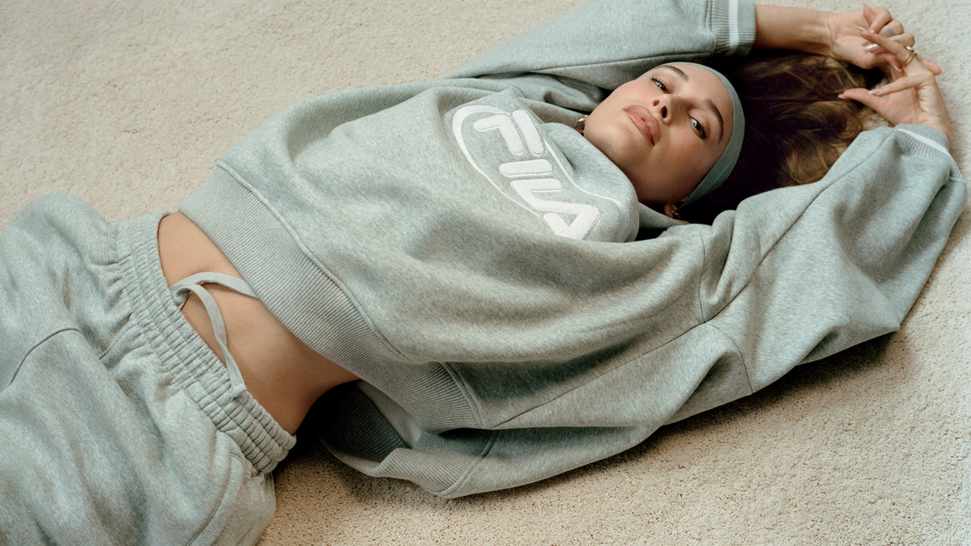
The activewear brand loved by celebs. But what's behind their success?
Weβre obsessed with Reformation β and there's two big reasons why.
The surprising evolution of this everyday store.
How Jess Hunt brought this brand to life through brand activations.
While the brands mentioned are not sponsored or paid advertisements, some of the products highlighted may earn us a commission.
Sign up for our newsletter to receive the latest brand news and insights from Brand Insider.