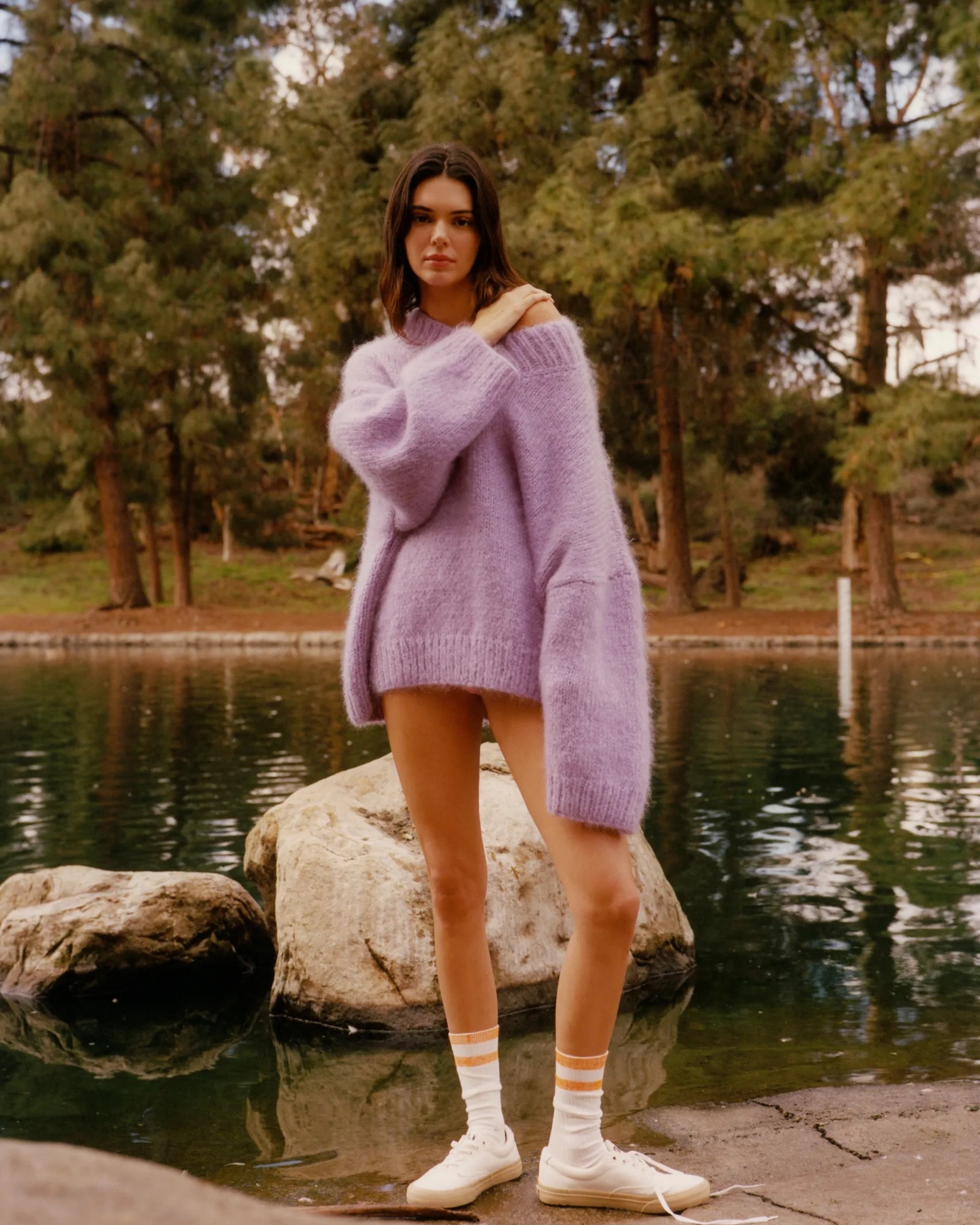
Say goodbye to that classic Christmas red—the festive season calls for colours that feel familiar yet fresh. If you're ready to give your holiday visuals a bit of a glow-up, try trading in the usual bright red for these rich, unexpected shades, ready to keep your visuals festive but elevated, making a lasting impression that feels seasonal and sophisticated without trying too hard.
Imagine this as a glass of rich, warm spiced wine on a winter night—deep berry tones that feel luxurious and festive without being too loud. This colour is perfect for holiday invites or as a background shade in social media designs. When paired with gold accents or creamy whites, it creates a feeling of luxury and tradition.
Not your average red, this burgundy is darker and moodier, with just a hint of purple that gives it that extra layer of sophistication. It’s versatile and effortlessly chic, ideal for product labels, accent details, or even elegant typography. Pair it with metallics for a luxe vibe, or go tonal with soft creams for that seasonal, understated look.
Crimson velvet feels festive but keeps it stylish—it’s brighter than mulled wine but still toned down from classic red, with a gorgeous depth. It’s perfect for brands that want to retain that festive vibrance while moving towards a more contemporary feel. Crimson velvet is especially striking against creamy whites or softer greens, so consider it for campaign highlights or luxury packaging.
If you still want that rich festive vibrance but with a mature twist, firelight red is your go-to. This colour has a lively warmth with just enough depth to set it apart from the typical holiday palette. Think call-to-action buttons, feature points, or those email banners everyone scrolls to—firelight red draws attention and feels fresh paired with black and white.
Deep, intense, and almost mysterious, dark garnet is a shade that commands attention without being overly bright. It’s perfect if you’re going for something nostalgic yet modern, especially for brands with a heritage touch. It plays beautifully with ivory or pale gold, making it feel grounded and warm—like a fresh take on a holiday classic.
Sign up for our newsletter to receive weekly case studies and insights from Brand Insider.
This brand perfected basics, here's how.
The activewear brand loved by celebs. But what's behind their success?
We’re obsessed with Reformation — and there's two big reasons why.
The surprising evolution of this everyday store.
How Jess Hunt brought this brand to life through brand activations.
Say goodbye to that classic Christmas red—the festive season calls for colours that feel familiar yet fresh. If you're ready to give your holiday visuals a bit of a glow-up, try trading in the usual bright red for these rich, unexpected shades, ready to keep your visuals festive but elevated, making a lasting impression that feels seasonal and sophisticated without trying too hard.
Imagine this as a glass of rich, warm spiced wine on a winter night—deep berry tones that feel luxurious and festive without being too loud. This colour is perfect for holiday invites or as a background shade in social media designs. When paired with gold accents or creamy whites, it creates a feeling of luxury and tradition.
Not your average red, this burgundy is darker and moodier, with just a hint of purple that gives it that extra layer of sophistication. It’s versatile and effortlessly chic, ideal for product labels, accent details, or even elegant typography. Pair it with metallics for a luxe vibe, or go tonal with soft creams for that seasonal, understated look.
Crimson velvet feels festive but keeps it stylish—it’s brighter than mulled wine but still toned down from classic red, with a gorgeous depth. It’s perfect for brands that want to retain that festive vibrance while moving towards a more contemporary feel. Crimson velvet is especially striking against creamy whites or softer greens, so consider it for campaign highlights or luxury packaging.
If you still want that rich festive vibrance but with a mature twist, firelight red is your go-to. This colour has a lively warmth with just enough depth to set it apart from the typical holiday palette. Think call-to-action buttons, feature points, or those email banners everyone scrolls to—firelight red draws attention and feels fresh paired with black and white.
Deep, intense, and almost mysterious, dark garnet is a shade that commands attention without being overly bright. It’s perfect if you’re going for something nostalgic yet modern, especially for brands with a heritage touch. It plays beautifully with ivory or pale gold, making it feel grounded and warm—like a fresh take on a holiday classic.
Sign up for our newsletter to receive weekly case studies and insights from Brand Insider.
This brand perfected basics, here's how.
The activewear brand loved by celebs. But what's behind their success?
We’re obsessed with Reformation — and there's two big reasons why.
The surprising evolution of this everyday store.
How Jess Hunt brought this brand to life through brand activations.
While the brands mentioned are not sponsored or paid advertisements, some of the products highlighted may earn us a commission.
Sign up for our newsletter to receive the latest brand news and insights from Brand Insider.