Sifting through the daily deluge of emails can often be a monotonous task, yet Sisters and Seekers manage to break through the clutter with their inventive approach. Their emails are a breath of fresh air, distinguished by their clever concepts and sharp wit. We think of them as the cool friend who always has the best outfits.
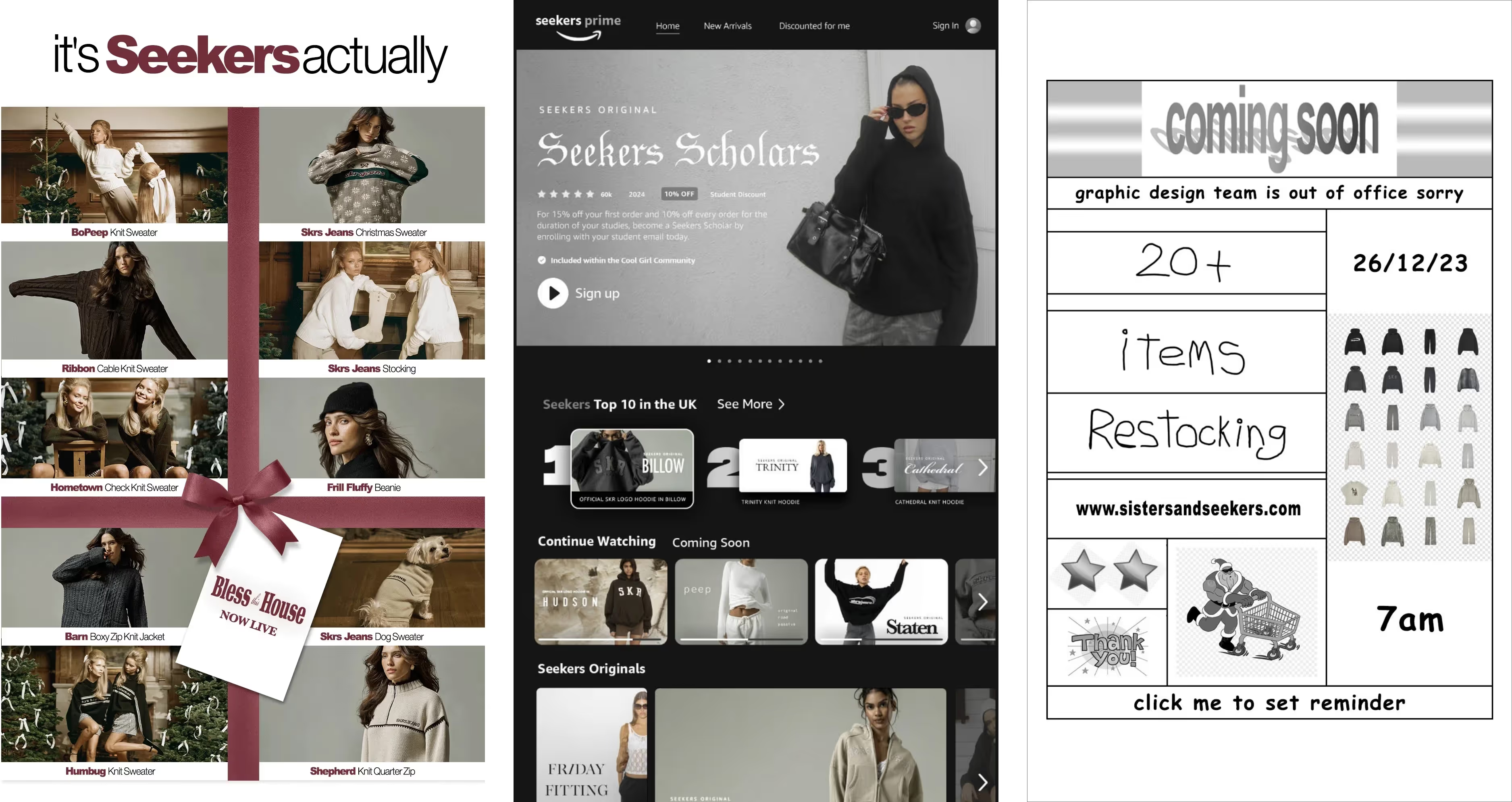
Their 'Seekers Prime' email was a playful nod to our binge-watching habits, while the 'Seekers Actually' campaign was a smart twist on classic holiday themes. They even turned a "graphic designer's day off" into a cheeky excuse for retro vibes that had us all in on the joke.
Keep it light, keep it clever, and don't be scared to show some personality. A little cleverness and a lot of creativity go a long way.
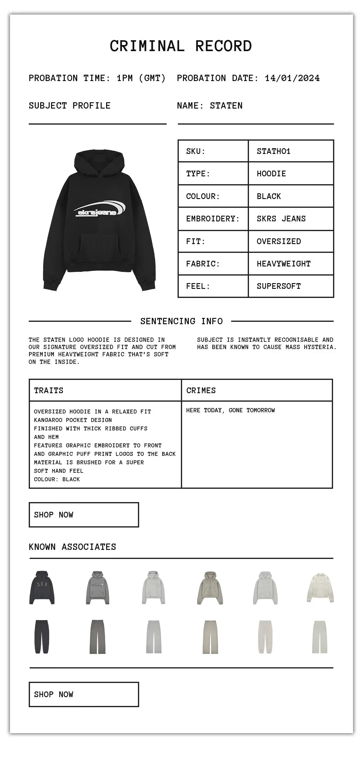
They're not afraid to be themselves and have a bit of fun with it. With playful email content, like the 'Criminal Record' for product highlights, Sisters and Seekers infuse humor and a distinct personality that aligns with their brand voice.
Don't be a faceless brand. Infuse your emails with character and humor that aligns with your brand identity to make your messages memorable and shareable.
They highlight their team and community involvement, like the 'Seekers' Team Highlights', which showcases their staff's favorite moments. This not only humanises the brand but also builds a sense of community among subscribers.
Build a community, not just a customer base. Share behind-the-scenes content and team stories to create a more personal connection with your audience.
From GIFs that capture attention to creative themes that keep content fresh, Sisters and Seekers' emails are anything but static. They leverage dynamic content to keep subscribers engaged and looking forward to what's next.
Keep it dynamic. Use varied content formats to maintain interest and anticipation among your subscribers.
Reformation's emails stand out, not by shouting the loudest, but by speaking directly to the hearts (and humour) of their audience. They know just what to say and how to say it without any extra fluff—that's what gets us clicking every time. They show that, when done right, emails can be an extension of your brand's story.
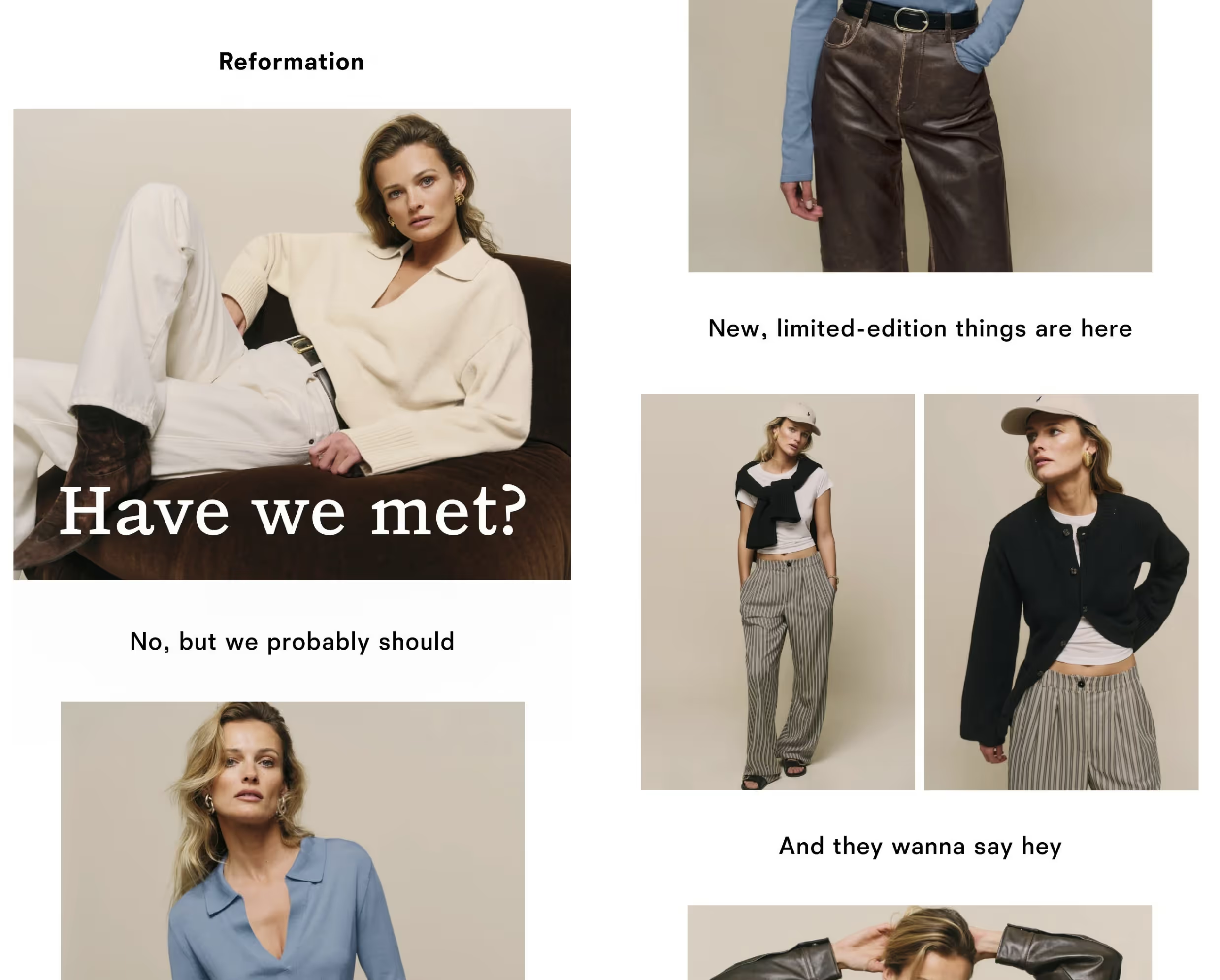
Reformation's emails feel like a chat with a friend, not a sales tactic. Their casual, conversational tone paired with a touch of humor—like "Have we met? No, but we probably should"—makes each message feel personalised and engaging.
Speak to your subscribers, not at them. Use conversational language that resonates with your audience's everyday experiences and inject humor where appropriate to keep the tone light and relatable.
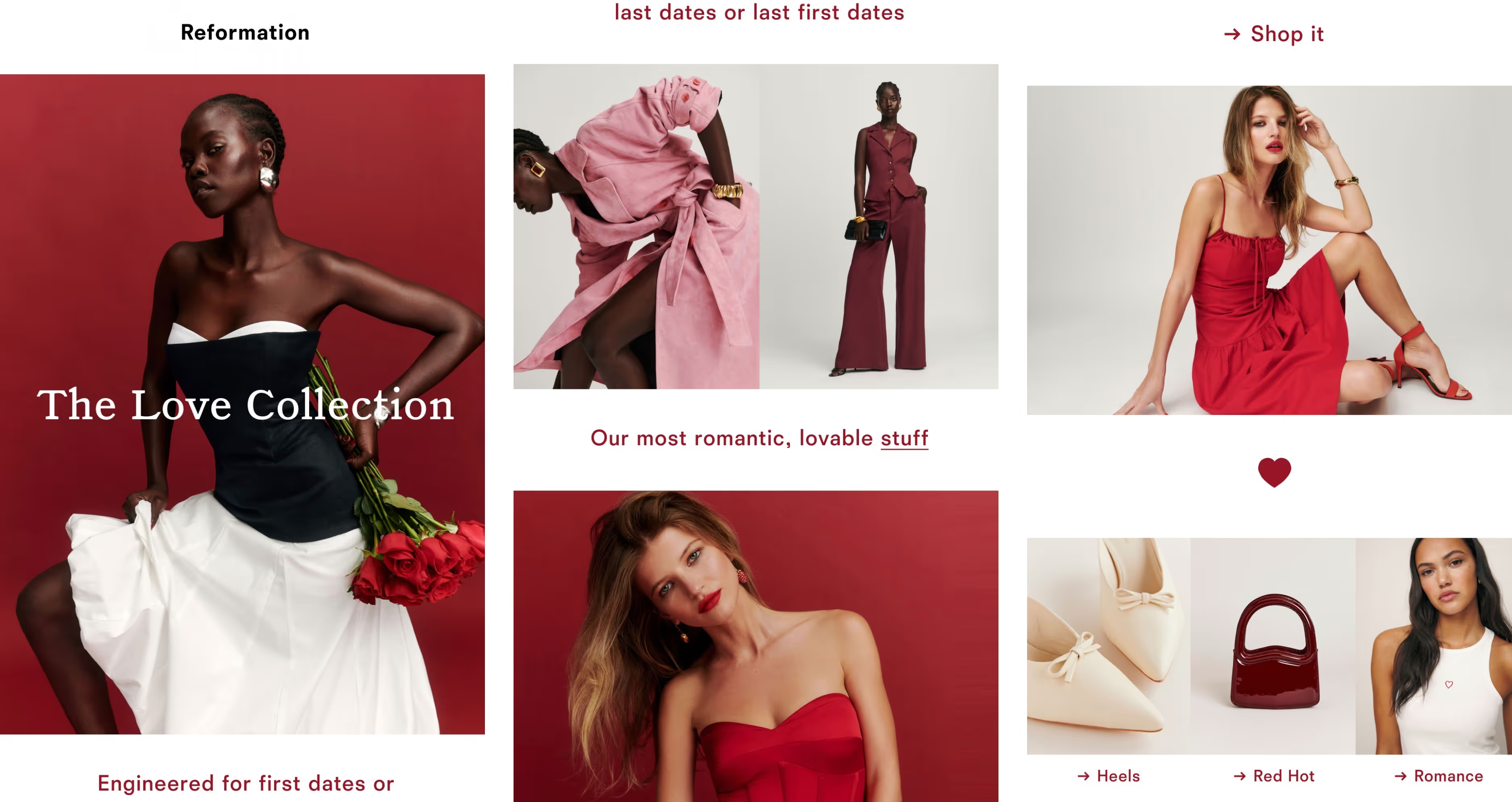
Reformation get 'less is more' right. Clean lines, ample white space, and a focus on high-quality product images make for an uncluttered and refined visual experience that aligns perfectly with their brand identity.
Embrace simplicity in your design. A clean and uncluttered layout can help your message and imagery stand out, making a strong impression on your subscribers.
Reformation's emails are often structured as a series of connected thoughts, leading the reader down a path of discovery. "We made a bunch of cute stuff... For you to be excited about in 5-7 business days" creates a storyline that leads to a call-to-action.
Create a thread in your messaging. Lead your reader on a journey with your content, making each email a step in a larger narrative.
Reformation knows just where to sprinkle their wit. "Ugh, January" immediately connect with the seasonal blues, while "Spend the night with these" teases with a double entendre.
Use wit strategically. A clever turn of phrase can pique interest and make your email memorable, but it should always align with your brand voice and audience's taste.
Wardrobe Icons delivers the inbox equivalent of that perfect cup of coffee – always welcome, no matter how often. Their easy-to-digest content makes us eager for more. Normally, the thought of receiving brand emails more than once a week might make us roll our eyes, but with Wardrobe Icons we honestly don't mind.
Every week, Wardrobe Icons presents a well-thought-out collection of items that resonate with their brand's ethos of timeless style. Each piece is showcased as an essential, not just a purchase.
Curate with care. Select products that reflect your brand's values and aesthetic. A carefully curated selection can establish your brand as a thought leader and go-to source for your customers' needs.
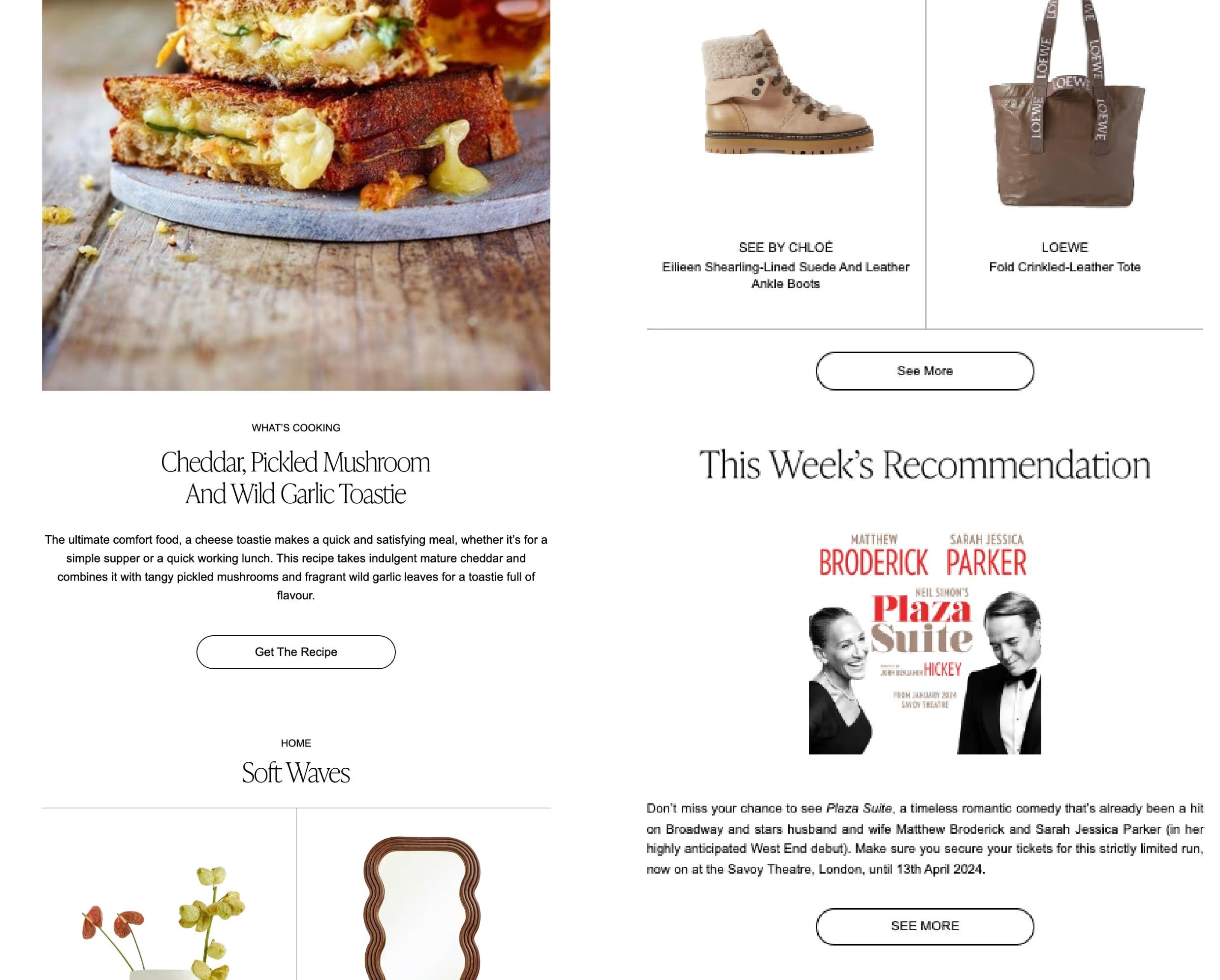
Beyond fashion, their emails often include lifestyle content, like a recipe or a book recommendation. This adds depth to their brand, positioning Wardrobe Icons as a holistic lifestyle curator.
Think beyond the product. Integrate lifestyle elements that complement your offerings to create a richer, more engaging narrative for your subscribers.
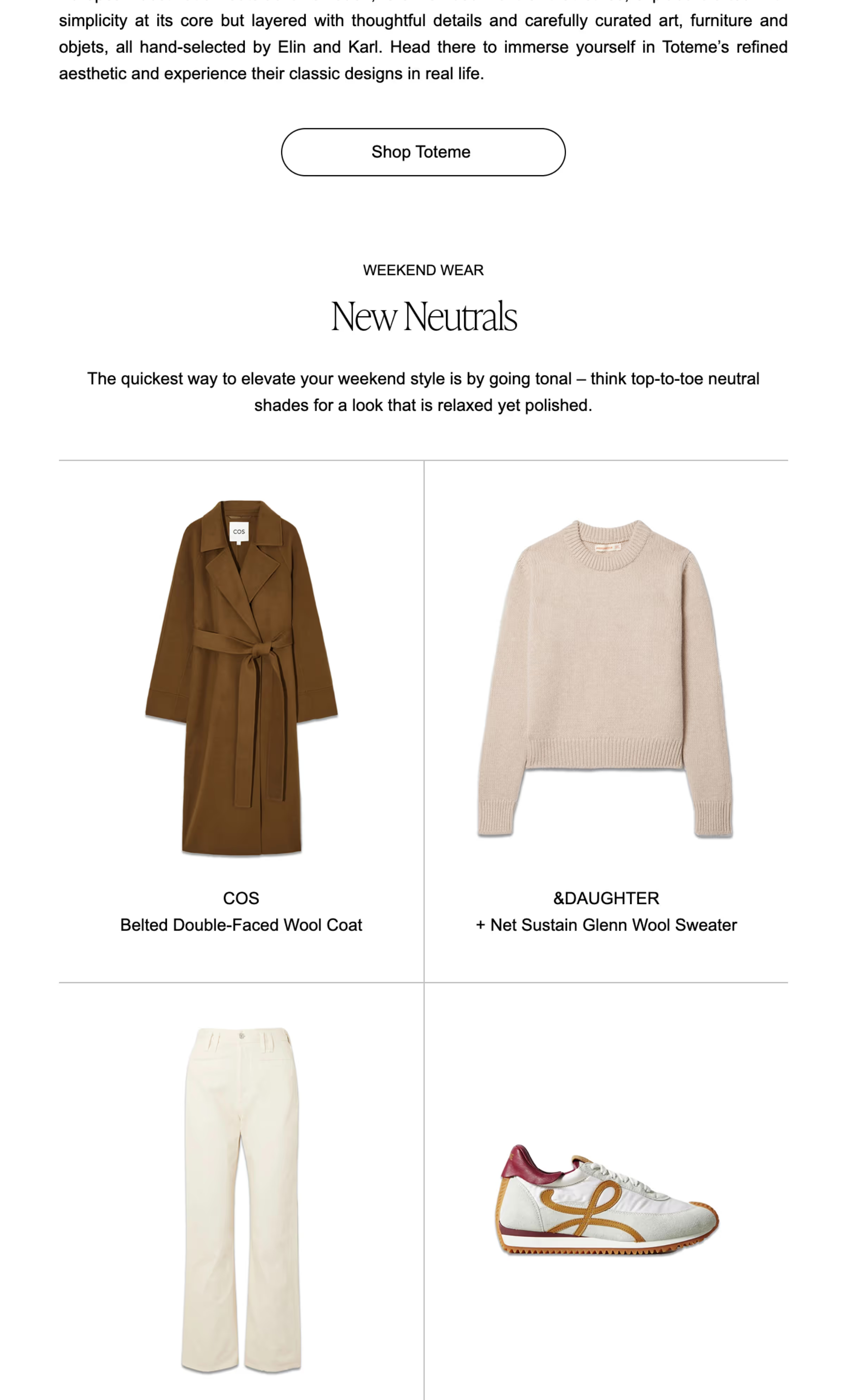
The visual layout of their emails is consistent and polished, with a clean aesthetic that matches the brand's focus on classic style. This consistency helps build a strong visual identity that subscribers recognize and trust.
Keep it consistent. A consistent visual identity across your emails helps to reinforce your brand and build trust with your audience.
Each email reads like an editor's letter, with recommendations and style tips that add a personal touch. It's a clever blend of commerce and content that respects the intelligence of its readers.
Be editorial. Use your emails to educate and engage with your audience, rather than just sell to them. Provide value that will keep subscribers coming back for more.
Sign up for our newsletter to receive weekly case studies and insights from Brand Insider.
This brand perfected basics, here's how.
The activewear brand loved by celebs. But what's behind their success?
We’re obsessed with Reformation — and there's two big reasons why.
The surprising evolution of this everyday store.
How Jess Hunt brought this brand to life through brand activations.
Sifting through the daily deluge of emails can often be a monotonous task, yet Sisters and Seekers manage to break through the clutter with their inventive approach. Their emails are a breath of fresh air, distinguished by their clever concepts and sharp wit. We think of them as the cool friend who always has the best outfits.
Their 'Seekers Prime' email was a playful nod to our binge-watching habits, while the 'Seekers Actually' campaign was a smart twist on classic holiday themes. They even turned a "graphic designer's day off" into a cheeky excuse for retro vibes that had us all in on the joke.
Keep it light, keep it clever, and don't be scared to show some personality. A little cleverness and a lot of creativity go a long way.
They're not afraid to be themselves and have a bit of fun with it. With playful email content, like the 'Criminal Record' for product highlights, Sisters and Seekers infuse humor and a distinct personality that aligns with their brand voice.
Don't be a faceless brand. Infuse your emails with character and humor that aligns with your brand identity to make your messages memorable and shareable.
They highlight their team and community involvement, like the 'Seekers' Team Highlights', which showcases their staff's favorite moments. This not only humanises the brand but also builds a sense of community among subscribers.
Build a community, not just a customer base. Share behind-the-scenes content and team stories to create a more personal connection with your audience.
From GIFs that capture attention to creative themes that keep content fresh, Sisters and Seekers' emails are anything but static. They leverage dynamic content to keep subscribers engaged and looking forward to what's next.
Keep it dynamic. Use varied content formats to maintain interest and anticipation among your subscribers.
Reformation's emails stand out, not by shouting the loudest, but by speaking directly to the hearts (and humour) of their audience. They know just what to say and how to say it without any extra fluff—that's what gets us clicking every time. They show that, when done right, emails can be an extension of your brand's story.
Reformation's emails feel like a chat with a friend, not a sales tactic. Their casual, conversational tone paired with a touch of humor—like "Have we met? No, but we probably should"—makes each message feel personalised and engaging.
Speak to your subscribers, not at them. Use conversational language that resonates with your audience's everyday experiences and inject humor where appropriate to keep the tone light and relatable.
Reformation get 'less is more' right. Clean lines, ample white space, and a focus on high-quality product images make for an uncluttered and refined visual experience that aligns perfectly with their brand identity.
Embrace simplicity in your design. A clean and uncluttered layout can help your message and imagery stand out, making a strong impression on your subscribers.
Reformation's emails are often structured as a series of connected thoughts, leading the reader down a path of discovery. "We made a bunch of cute stuff... For you to be excited about in 5-7 business days" creates a storyline that leads to a call-to-action.
Create a thread in your messaging. Lead your reader on a journey with your content, making each email a step in a larger narrative.
Reformation knows just where to sprinkle their wit. "Ugh, January" immediately connect with the seasonal blues, while "Spend the night with these" teases with a double entendre.
Use wit strategically. A clever turn of phrase can pique interest and make your email memorable, but it should always align with your brand voice and audience's taste.
Wardrobe Icons delivers the inbox equivalent of that perfect cup of coffee – always welcome, no matter how often. Their easy-to-digest content makes us eager for more. Normally, the thought of receiving brand emails more than once a week might make us roll our eyes, but with Wardrobe Icons we honestly don't mind.
Every week, Wardrobe Icons presents a well-thought-out collection of items that resonate with their brand's ethos of timeless style. Each piece is showcased as an essential, not just a purchase.
Curate with care. Select products that reflect your brand's values and aesthetic. A carefully curated selection can establish your brand as a thought leader and go-to source for your customers' needs.
Beyond fashion, their emails often include lifestyle content, like a recipe or a book recommendation. This adds depth to their brand, positioning Wardrobe Icons as a holistic lifestyle curator.
Think beyond the product. Integrate lifestyle elements that complement your offerings to create a richer, more engaging narrative for your subscribers.
The visual layout of their emails is consistent and polished, with a clean aesthetic that matches the brand's focus on classic style. This consistency helps build a strong visual identity that subscribers recognize and trust.
Keep it consistent. A consistent visual identity across your emails helps to reinforce your brand and build trust with your audience.
Each email reads like an editor's letter, with recommendations and style tips that add a personal touch. It's a clever blend of commerce and content that respects the intelligence of its readers.
Be editorial. Use your emails to educate and engage with your audience, rather than just sell to them. Provide value that will keep subscribers coming back for more.
Sign up for our newsletter to receive weekly case studies and insights from Brand Insider.
This brand perfected basics, here's how.
The activewear brand loved by celebs. But what's behind their success?
We’re obsessed with Reformation — and there's two big reasons why.
The surprising evolution of this everyday store.
How Jess Hunt brought this brand to life through brand activations.
While the brands mentioned are not sponsored or paid advertisements, some of the products highlighted may earn us a commission.
Sign up for our newsletter to receive the latest brand news and insights from Brand Insider.