Hailey Bieber's Rhode Skin launched in the summer of 2022. Over a year later, the buzz hasn't faded in the slightest. I love how the brand has brilliantly combined effective formulas with a playful vibe. Rhode sets itself apart with fun scents, aesthetically pleasing packaging, and the excitement of limited-time releases. They've successfully transformed a simple lip treatment into a mini-luxury, a strategy that's played a huge role in the brand's viral status.

I only recently came across Sisters and Seekers early this year. And I instantly fell in love with the amazing quality of their hoodies. But beyond their viral sell-out hoodies, this brand understands the power of community. Their approach to client engagement is exceptional, particularly their tiered rewards system. This strategy makes their existing customers feel like VIPs while tempting new shoppers to become a part of this exclusive "cool girl" club. It's a clever blend of inclusion and aspiration—a marketing strategy worth noting.
Kim Kardashian's Skims is always a great playbook in strategy and branding. The brand has transcended its shapewear origins to become a full-fledged lifestyle brand. With a multitude of successful collections and collaborations, Skims demonstrates a profound understanding of market dynamics. Their ability to understand their target market and consistently deliver what they want while engaging with a wide range of audiences sets them apart in the highly competitive fashion industry.

My golden rule in design: never settle on your first draft. I advocate for a 'copy, paste, refine, repeat' method, which allows for continuous improvement and innovation. It’s about crafting until your work is not just good, but great.

For designers in a lull, remember: passion projects are your portfolio's secret weapon. Design for your dream client, even if they’re imaginary. Create a portfolio that speaks directly to your ideal brands. This proactive approach speaks volumes about your creativity and ambition.

Pinterest is my go-to for mood board curation. I gather everything that catches my eye into a 'Moodboard' master folder, supplemented by sub-boards for specific styles and aesthetics. By creating sub-boards for different styles and aesthetics, I save countless hours when it's time to conceptualise a new project.
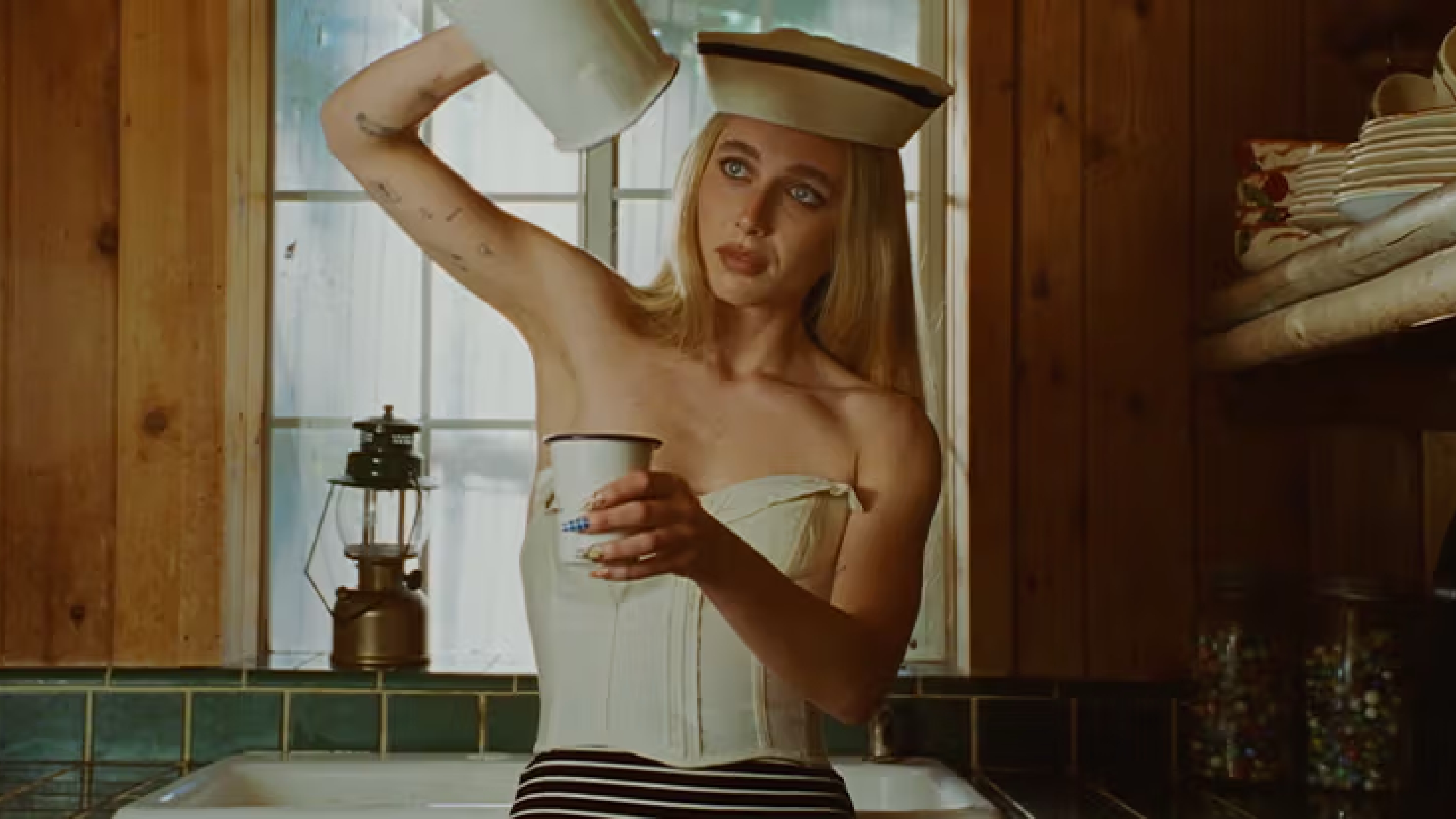
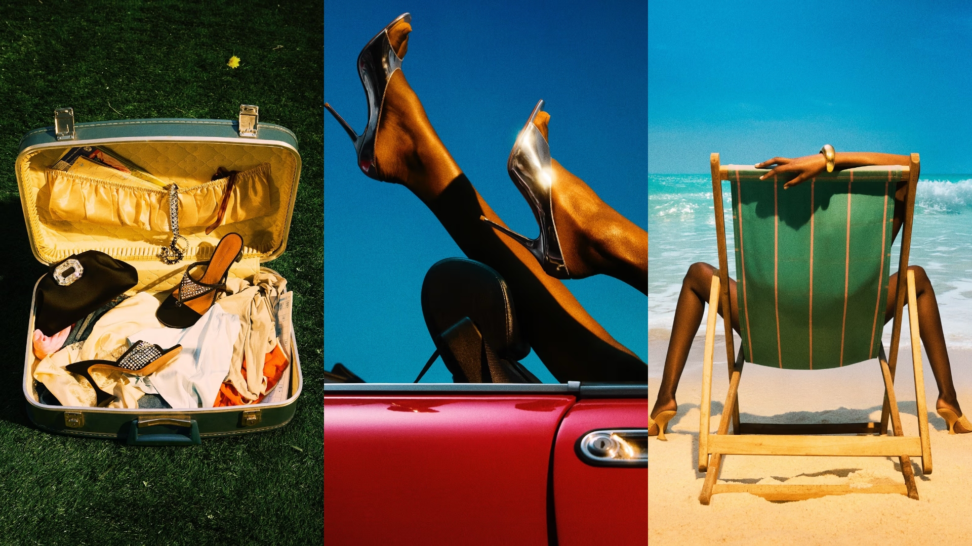
Right now, I'm all about dark, pasty monochrome palettes—think khaki greens, ink blues, and a range of skin tones, greys, and whites. These shades are versatile, lending themselves to a variety of styles and seasons. And for a touch of warmth, I’m loving blushy, subtle pinks—a refined step post-Barbiecore.

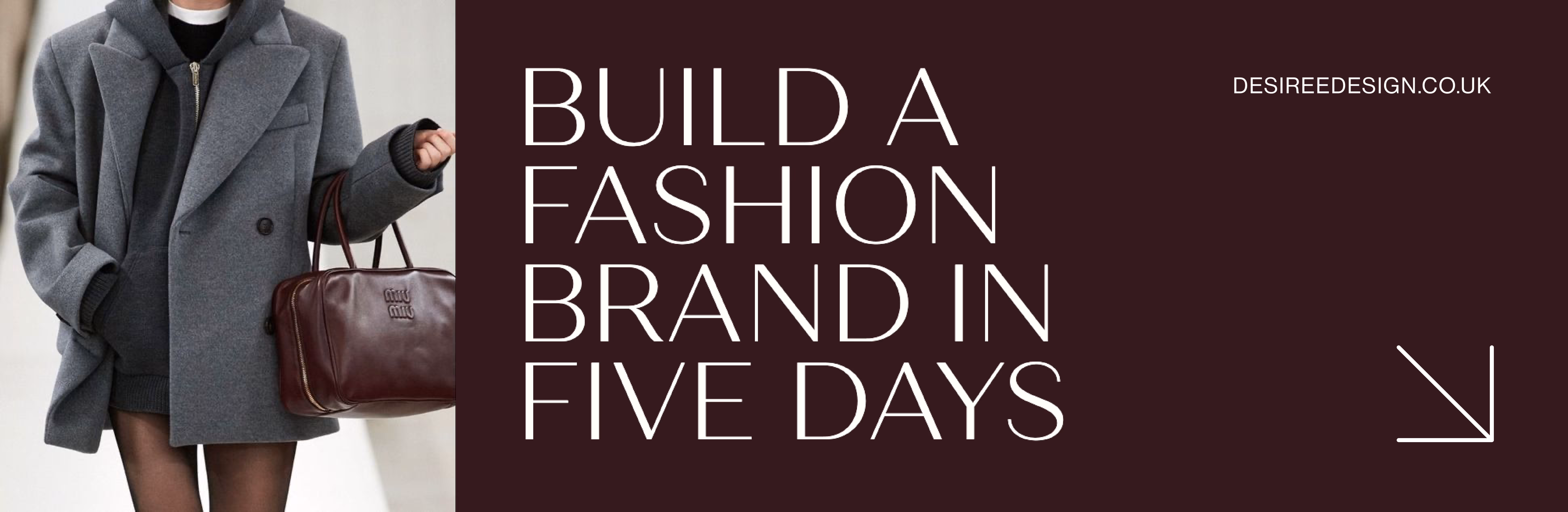
When it comes to my personal design style, think editorial, high-end, and clean. Leaning towards layouts with white space, complemented by classic font pairings. The focus is always on strong brand imagery, supported by a muted yet strong colour palette, with black and off-white as staples. This approach ensures a timeless, sophisticated aesthetic that elevates any brand's visual narrative.

A growing trend to watch out for is brevity in storytelling. As attention spans dwindle, brands need to adapt quickly. This calls for rich visuals and micro-content. We’re witnessing a broader cultural shift towards fast-paced, visually-driven communication. I’m constantly exploring ways to captivate and engage audiences by using powerful imagery and succinct messages for my clients. It’s about delivering the essence of a brand or message in a way that's immediate, impactful, and memorable.
If I were to choose just one font to use forever, my sans-serif pick would undoubtedly be Helvetica Neue. Its clean, crisp, and modern appearance makes it incredibly versatile and suitable for everything from bold headlines to nuanced body text.

On the serif side, my heart belongs to Garamond—a classic font that exudes elegance and timelessness. Garamond's subtle sophistication and readability make it a go-to for any design that requires a touch of classical charm without sacrificing contemporary appeal.

My all-time favourite design period is the era of Surrealism (1925–1930). Max Ernst's "Gala Éluard," Hans Bellmer's "The Doll," and René Magritte’s "La Clairvoyance". I remember learning about surrealism in art class. Blurring the lines between reality and fantasy, logic and illogic, to create compelling, thought-provoking pieces is something I've always found really interesting.


.svg)


.svg)
.svg)