Art Direction

Everyone Has Good Taste. So Why Does Everything Look the Same?

By
Bibiana Obahor
July 22, 2026
Images supplied by Desiree Design Studio
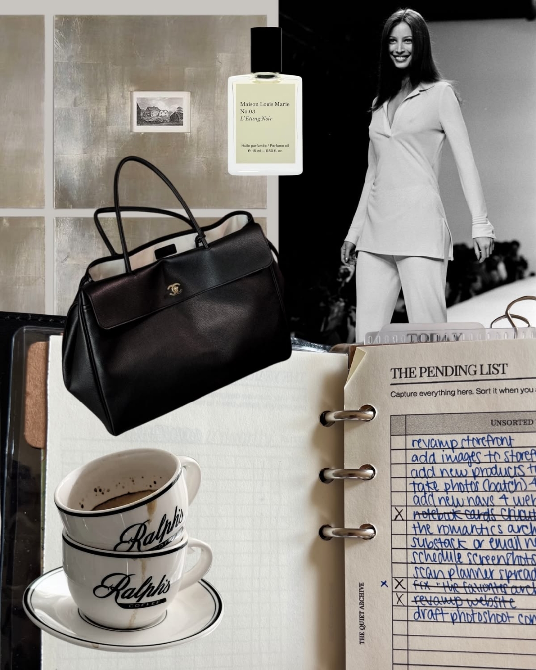
You know the room before you have entered it. The expensive lamp, the art book left just so, the typography that suggests an excellent magazine collection. There is nothing wrong with liking any of it. The difficulty comes when these familiar signs of discernment start making decisions on everyone’s behalf. For a brand trying to express something particular, looking as though it has good taste can become a remarkably effective way of saying very little.

Taste develops through what we pay attention to. Repeatedly looking at a room, a photograph or a piece of clothing teaches us to notice relationships we missed before. We begin to distinguish a deliberate choice from a convenient one. That education need not happen in a classroom, and it does not require us to like everything we encounter.

Some people may find particular visual relationships easier to recognise. That does not make the circumstances in which they encounter those relationships irrelevant. Access to books, places, clothes and people shapes what becomes familiar. Describing the result as entirely innate can make a long history of attention look like a mysterious gift.

For a brand, that distinction matters because “they have taste” is an incomplete hiring brief. Taste for what, for whom, and under which constraints? Someone can make a beautiful fashion image and still be the wrong person to help a neighbourhood bakery explain why its bread costs more. The bakery needs choices that suit its customers and its actual operation.

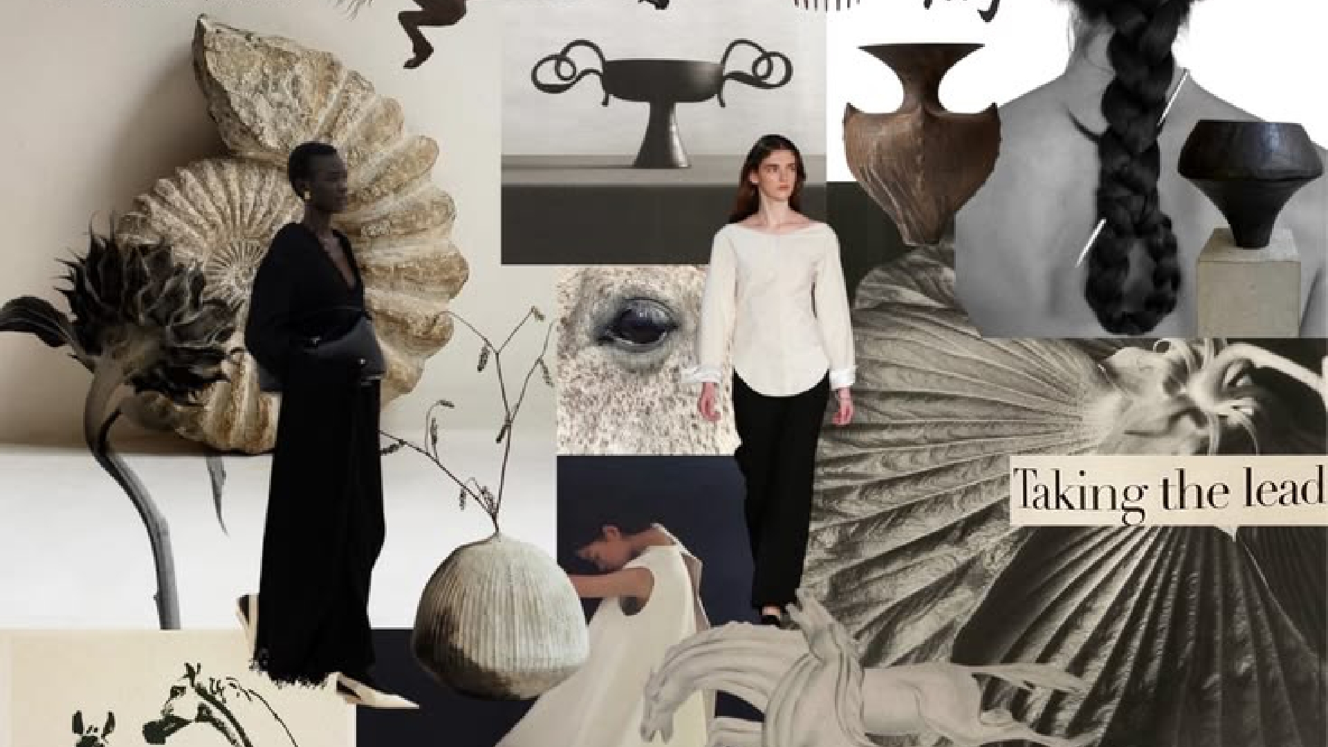
The trouble starts when recognition becomes the brief. A client collects images that already look successful; a designer finds more of the same. Each reference seems sensible in isolation. Put them together and the new business begins to resemble a category it has barely entered. The mood board has supplied a dress code before anyone has worked out what needs expressing.

I would be careful about turning that into another universal complaint about minimalism. Restraint can be an excellent decision. So can abundance, awkwardness or a colour combination that would never make it onto a neutral mood board. The question is whether the choice does a job beyond signalling that its maker has seen the right things.

Consider a hypothetical hotel identity. A quiet serif, pale paper and softly lit photography might suit it beautifully. But if the hotel’s defining quality is a lively relationship with its neighbourhood, a visual system that removes every sign of local life could misrepresent the stay. The work would look polished while making the business harder to understand.

This is the difference between preference and direction. Preference tells us what someone likes. Direction requires them to explain which parts of that preference are relevant, what should be left out, and how the decision will hold up across a booking page, a room key and a complaint at reception.

One useful way out is to look at work made for a completely different job. The bakery might learn more from a market stall than a luxury perfume campaign. A hotel could study how a local paper explains its neighbourhood. Changing the question changes what counts as a good reference, and makes imitation a less convenient answer.

A transport map has lessons about hierarchy. A mail-order catalogue has lessons about explaining a product without holding it. An old community notice can show how urgency and warmth share a page. These references become useful when we ask how they worked, rather than simply collecting their appearance.

Good judgement should also be able to survive disagreement. If the defence of a choice stops at “it looks better”, the client has very little to work with. A clearer explanation might be that the new hierarchy makes prices easier to compare, or that a warmer photographic style reflects the service customers already value. That gives everyone something concrete to assess.

The exciting thing about taste is its capacity to make an unexpected connection feel right. Reducing it to a dress code makes it smaller. I would rather know why someone chose the unfashionable reference that solved the problem than watch another roomful of people quietly agree on the same expensive lamp.

SUBSCRIBE

The ultimate guide for the modern brand owner, delivered straight to your inbox.
Thank you for subscribing!
Oops! Something went wrong while submitting the form.
Share button
linkedinpinterestmail
Art Direction

Everyone Has Good Taste. So Why Does Everything Look the Same?

You know the room before you have entered it. The expensive lamp, the art book left just so, the typography that suggests an excellent magazine collection. There is nothing wrong with liking any of it. The difficulty comes when these familiar signs of discernment start making decisions on everyone’s behalf. For a brand trying to express something particular, looking as though it has good taste can become a remarkably effective way of saying very little.

By
Bibiana Obahor
July 22, 2026
Images supplied by Desiree Design Studio

Taste develops through what we pay attention to. Repeatedly looking at a room, a photograph or a piece of clothing teaches us to notice relationships we missed before. We begin to distinguish a deliberate choice from a convenient one. That education need not happen in a classroom, and it does not require us to like everything we encounter.

Some people may find particular visual relationships easier to recognise. That does not make the circumstances in which they encounter those relationships irrelevant. Access to books, places, clothes and people shapes what becomes familiar. Describing the result as entirely innate can make a long history of attention look like a mysterious gift.

For a brand, that distinction matters because “they have taste” is an incomplete hiring brief. Taste for what, for whom, and under which constraints? Someone can make a beautiful fashion image and still be the wrong person to help a neighbourhood bakery explain why its bread costs more. The bakery needs choices that suit its customers and its actual operation.

The trouble starts when recognition becomes the brief. A client collects images that already look successful; a designer finds more of the same. Each reference seems sensible in isolation. Put them together and the new business begins to resemble a category it has barely entered. The mood board has supplied a dress code before anyone has worked out what needs expressing.

I would be careful about turning that into another universal complaint about minimalism. Restraint can be an excellent decision. So can abundance, awkwardness or a colour combination that would never make it onto a neutral mood board. The question is whether the choice does a job beyond signalling that its maker has seen the right things.

Consider a hypothetical hotel identity. A quiet serif, pale paper and softly lit photography might suit it beautifully. But if the hotel’s defining quality is a lively relationship with its neighbourhood, a visual system that removes every sign of local life could misrepresent the stay. The work would look polished while making the business harder to understand.

This is the difference between preference and direction. Preference tells us what someone likes. Direction requires them to explain which parts of that preference are relevant, what should be left out, and how the decision will hold up across a booking page, a room key and a complaint at reception.

One useful way out is to look at work made for a completely different job. The bakery might learn more from a market stall than a luxury perfume campaign. A hotel could study how a local paper explains its neighbourhood. Changing the question changes what counts as a good reference, and makes imitation a less convenient answer.

A transport map has lessons about hierarchy. A mail-order catalogue has lessons about explaining a product without holding it. An old community notice can show how urgency and warmth share a page. These references become useful when we ask how they worked, rather than simply collecting their appearance.

Good judgement should also be able to survive disagreement. If the defence of a choice stops at “it looks better”, the client has very little to work with. A clearer explanation might be that the new hierarchy makes prices easier to compare, or that a warmer photographic style reflects the service customers already value. That gives everyone something concrete to assess.

The exciting thing about taste is its capacity to make an unexpected connection feel right. Reducing it to a dress code makes it smaller. I would rather know why someone chose the unfashionable reference that solved the problem than watch another roomful of people quietly agree on the same expensive lamp.

Share button
linkedinpinterestmail
Art Direction

Everyone Has Good Taste. So Why Does Everything Look the Same?

You know the room before you have entered it. The expensive lamp, the art book left just so, the typography that suggests an excellent magazine collection. There is nothing wrong with liking any of it. The difficulty comes when these familiar signs of discernment start making decisions on everyone’s behalf. For a brand trying to express something particular, looking as though it has good taste can become a remarkably effective way of saying very little.

By
Bibiana Obahor
July 22, 2026
Images supplied by Desiree Design Studio

Taste develops through what we pay attention to. Repeatedly looking at a room, a photograph or a piece of clothing teaches us to notice relationships we missed before. We begin to distinguish a deliberate choice from a convenient one. That education need not happen in a classroom, and it does not require us to like everything we encounter.

Some people may find particular visual relationships easier to recognise. That does not make the circumstances in which they encounter those relationships irrelevant. Access to books, places, clothes and people shapes what becomes familiar. Describing the result as entirely innate can make a long history of attention look like a mysterious gift.

For a brand, that distinction matters because “they have taste” is an incomplete hiring brief. Taste for what, for whom, and under which constraints? Someone can make a beautiful fashion image and still be the wrong person to help a neighbourhood bakery explain why its bread costs more. The bakery needs choices that suit its customers and its actual operation.

The trouble starts when recognition becomes the brief. A client collects images that already look successful; a designer finds more of the same. Each reference seems sensible in isolation. Put them together and the new business begins to resemble a category it has barely entered. The mood board has supplied a dress code before anyone has worked out what needs expressing.

I would be careful about turning that into another universal complaint about minimalism. Restraint can be an excellent decision. So can abundance, awkwardness or a colour combination that would never make it onto a neutral mood board. The question is whether the choice does a job beyond signalling that its maker has seen the right things.

Consider a hypothetical hotel identity. A quiet serif, pale paper and softly lit photography might suit it beautifully. But if the hotel’s defining quality is a lively relationship with its neighbourhood, a visual system that removes every sign of local life could misrepresent the stay. The work would look polished while making the business harder to understand.

This is the difference between preference and direction. Preference tells us what someone likes. Direction requires them to explain which parts of that preference are relevant, what should be left out, and how the decision will hold up across a booking page, a room key and a complaint at reception.

One useful way out is to look at work made for a completely different job. The bakery might learn more from a market stall than a luxury perfume campaign. A hotel could study how a local paper explains its neighbourhood. Changing the question changes what counts as a good reference, and makes imitation a less convenient answer.

A transport map has lessons about hierarchy. A mail-order catalogue has lessons about explaining a product without holding it. An old community notice can show how urgency and warmth share a page. These references become useful when we ask how they worked, rather than simply collecting their appearance.

Good judgement should also be able to survive disagreement. If the defence of a choice stops at “it looks better”, the client has very little to work with. A clearer explanation might be that the new hierarchy makes prices easier to compare, or that a warmer photographic style reflects the service customers already value. That gives everyone something concrete to assess.

The exciting thing about taste is its capacity to make an unexpected connection feel right. Reducing it to a dress code makes it smaller. I would rather know why someone chose the unfashionable reference that solved the problem than watch another roomful of people quietly agree on the same expensive lamp.

Share button
linkedinpinterestmail
Art Direction

Everyone Has Good Taste. So Why Does Everything Look the Same?

By
Bibiana Obahor
July 22, 2026
Images supplied by Desiree Design Studio
You know the room before you have entered it. The expensive lamp, the art book left just so, the typography that suggests an excellent magazine collection. There is nothing wrong with liking any of it. The difficulty comes when these familiar signs of discernment start making decisions on everyone’s behalf. For a brand trying to express something particular, looking as though it has good taste can become a remarkably effective way of saying very little.

While the brands mentioned are not sponsored or paid advertisements, some of the products highlighted may earn us a commission.

Sign up for our newsletter to receive the latest brand news and insights from Brand Insider.

Share button
linkedinpinterestmail
⌃