Branding

When Your Favourite Brand Gets a Little Too Cool for You

By
Bibiana Obahor
September 10, 2026
Images supplied by Desiree Design Studio
You open the website of a brand you used to love and find that everything looks rather good. More polished, perhaps. A little more expensive. The trouble is that you no longer quite recognise the person it seems to be dressing. Sézane’s new chapter offers a way into that awkward feeling: the moment a business calls something an evolution and a customer starts to wonder whether she is still part of the picture.

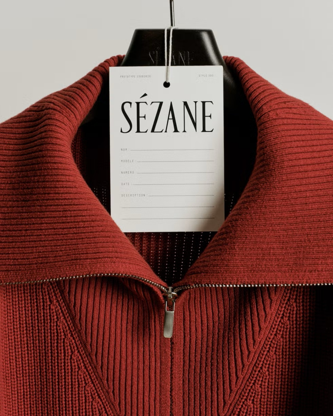
Sézane offers an interesting way into this. Its recent identity update replaces the familiar flowing signature with a more upright, condensed, uppercase serif wordmark. The difference is visible before you have looked at a single garment. One feels like a name written by someone; the other sits more formally on the page. Neither treatment can tell us whether the clothes have improved. Both can influence what we expect to find.

The wider direction matters too. Sézane has introduced this as a new chapter, with sharper styling and an intention to make more considered choices around its collections. The wordmark belongs to a broader act of editing. Looking at it only as a font choice misses the question a customer is actually trying to answer: is this still somewhere for me?

That question contains more than taste. A customer might love the things a brand makes while feeling less comfortable with the life it now depicts. Perhaps the styling has become more formal. Perhaps the people in the imagery seem further away from her own circumstances. Perhaps the little details that made the shopping experience feel approachable have been replaced by a cooler kind of distance.

A rebrand can therefore unsettle a customer without giving her an obvious fault to point to. The clothes might still be well made and the website easier to use. What has changed is her sense of belonging. The customer is evaluating the relationship, while the brand may be talking about visual consistency.

There is a commercial tension here. Brands need room to change. A business built around its founder at one stage of her life cannot be expected to preserve that stage indefinitely. New categories can require different presentation. Growing into new markets may expose gaps that loyal customers, already fluent in the brand, never notice.

Meanwhile, familiarity has value. People return partly because they know what they will get. They have learned the sizing, the styling and the small cues that help them decide whether something belongs in their wardrobe. If too many of those cues change together, the customer has to do that work again. A more sophisticated identity can therefore make an existing relationship feel less convenient.

I think this is where conversations about “elevating” a brand become slippery. Elevated according to whom? A more restrained website might make a product easier to appreciate. It might also remove the warmth that made someone interested in the first place. Looking more expensive is not automatically the same as becoming more desirable to the people already buying.

The practical test is what survives underneath the new presentation. Can customers still recognise the product point of view? Does the service feel familiar? Are the reasons they trusted the brand still easy to find? Continuity can live in a cut, an honest product description or a reliable returns experience, even when the typography changes completely.

Customers have some adjusting to do as well. A brand growing away from our preferences is not necessarily a brand making a mistake. We can acknowledge that a new direction makes sense and still decide we preferred the old one. Affection does not create an obligation to keep purchasing.

The most revealing moment comes after the initial reaction has passed. Someone returns to the website because she needs a coat, rather than because she wants to inspect the logo. She finds something she can picture wearing, understands why it costs what it costs, and feels comfortable ordering it. That is where the new chapter has to earn its place. The announcement gets attention; the next ordinary purchase tells us whether the relationship still works.
SUBSCRIBE

The ultimate guide for the modern brand owner, delivered straight to your inbox.
Thank you for subscribing!
Oops! Something went wrong while submitting the form.
Share button
linkedinpinterestmail
Branding

When Your Favourite Brand Gets a Little Too Cool for You

You open the website of a brand you used to love and find that everything looks rather good. More polished, perhaps. A little more expensive. The trouble is that you no longer quite recognise the person it seems to be dressing. Sézane’s new chapter offers a way into that awkward feeling: the moment a business calls something an evolution and a customer starts to wonder whether she is still part of the picture.

By
Bibiana Obahor
September 10, 2026
Images supplied by Desiree Design Studio

Sézane offers an interesting way into this. Its recent identity update replaces the familiar flowing signature with a more upright, condensed, uppercase serif wordmark. The difference is visible before you have looked at a single garment. One feels like a name written by someone; the other sits more formally on the page. Neither treatment can tell us whether the clothes have improved. Both can influence what we expect to find.

The wider direction matters too. Sézane has introduced this as a new chapter, with sharper styling and an intention to make more considered choices around its collections. The wordmark belongs to a broader act of editing. Looking at it only as a font choice misses the question a customer is actually trying to answer: is this still somewhere for me?

That question contains more than taste. A customer might love the things a brand makes while feeling less comfortable with the life it now depicts. Perhaps the styling has become more formal. Perhaps the people in the imagery seem further away from her own circumstances. Perhaps the little details that made the shopping experience feel approachable have been replaced by a cooler kind of distance.

A rebrand can therefore unsettle a customer without giving her an obvious fault to point to. The clothes might still be well made and the website easier to use. What has changed is her sense of belonging. The customer is evaluating the relationship, while the brand may be talking about visual consistency.

There is a commercial tension here. Brands need room to change. A business built around its founder at one stage of her life cannot be expected to preserve that stage indefinitely. New categories can require different presentation. Growing into new markets may expose gaps that loyal customers, already fluent in the brand, never notice.

Meanwhile, familiarity has value. People return partly because they know what they will get. They have learned the sizing, the styling and the small cues that help them decide whether something belongs in their wardrobe. If too many of those cues change together, the customer has to do that work again. A more sophisticated identity can therefore make an existing relationship feel less convenient.

I think this is where conversations about “elevating” a brand become slippery. Elevated according to whom? A more restrained website might make a product easier to appreciate. It might also remove the warmth that made someone interested in the first place. Looking more expensive is not automatically the same as becoming more desirable to the people already buying.

The practical test is what survives underneath the new presentation. Can customers still recognise the product point of view? Does the service feel familiar? Are the reasons they trusted the brand still easy to find? Continuity can live in a cut, an honest product description or a reliable returns experience, even when the typography changes completely.

Customers have some adjusting to do as well. A brand growing away from our preferences is not necessarily a brand making a mistake. We can acknowledge that a new direction makes sense and still decide we preferred the old one. Affection does not create an obligation to keep purchasing.

The most revealing moment comes after the initial reaction has passed. Someone returns to the website because she needs a coat, rather than because she wants to inspect the logo. She finds something she can picture wearing, understands why it costs what it costs, and feels comfortable ordering it. That is where the new chapter has to earn its place. The announcement gets attention; the next ordinary purchase tells us whether the relationship still works.

Share button
linkedinpinterestmail
Branding

When Your Favourite Brand Gets a Little Too Cool for You

You open the website of a brand you used to love and find that everything looks rather good. More polished, perhaps. A little more expensive. The trouble is that you no longer quite recognise the person it seems to be dressing. Sézane’s new chapter offers a way into that awkward feeling: the moment a business calls something an evolution and a customer starts to wonder whether she is still part of the picture.

By
Bibiana Obahor
September 10, 2026
Images supplied by Desiree Design Studio

Sézane offers an interesting way into this. Its recent identity update replaces the familiar flowing signature with a more upright, condensed, uppercase serif wordmark. The difference is visible before you have looked at a single garment. One feels like a name written by someone; the other sits more formally on the page. Neither treatment can tell us whether the clothes have improved. Both can influence what we expect to find.

The wider direction matters too. Sézane has introduced this as a new chapter, with sharper styling and an intention to make more considered choices around its collections. The wordmark belongs to a broader act of editing. Looking at it only as a font choice misses the question a customer is actually trying to answer: is this still somewhere for me?

That question contains more than taste. A customer might love the things a brand makes while feeling less comfortable with the life it now depicts. Perhaps the styling has become more formal. Perhaps the people in the imagery seem further away from her own circumstances. Perhaps the little details that made the shopping experience feel approachable have been replaced by a cooler kind of distance.

A rebrand can therefore unsettle a customer without giving her an obvious fault to point to. The clothes might still be well made and the website easier to use. What has changed is her sense of belonging. The customer is evaluating the relationship, while the brand may be talking about visual consistency.

There is a commercial tension here. Brands need room to change. A business built around its founder at one stage of her life cannot be expected to preserve that stage indefinitely. New categories can require different presentation. Growing into new markets may expose gaps that loyal customers, already fluent in the brand, never notice.

Meanwhile, familiarity has value. People return partly because they know what they will get. They have learned the sizing, the styling and the small cues that help them decide whether something belongs in their wardrobe. If too many of those cues change together, the customer has to do that work again. A more sophisticated identity can therefore make an existing relationship feel less convenient.

I think this is where conversations about “elevating” a brand become slippery. Elevated according to whom? A more restrained website might make a product easier to appreciate. It might also remove the warmth that made someone interested in the first place. Looking more expensive is not automatically the same as becoming more desirable to the people already buying.

The practical test is what survives underneath the new presentation. Can customers still recognise the product point of view? Does the service feel familiar? Are the reasons they trusted the brand still easy to find? Continuity can live in a cut, an honest product description or a reliable returns experience, even when the typography changes completely.

Customers have some adjusting to do as well. A brand growing away from our preferences is not necessarily a brand making a mistake. We can acknowledge that a new direction makes sense and still decide we preferred the old one. Affection does not create an obligation to keep purchasing.

The most revealing moment comes after the initial reaction has passed. Someone returns to the website because she needs a coat, rather than because she wants to inspect the logo. She finds something she can picture wearing, understands why it costs what it costs, and feels comfortable ordering it. That is where the new chapter has to earn its place. The announcement gets attention; the next ordinary purchase tells us whether the relationship still works.

Share button
linkedinpinterestmail
Branding

When Your Favourite Brand Gets a Little Too Cool for You

By
Bibiana Obahor
September 10, 2026
Images supplied by Desiree Design Studio
You open the website of a brand you used to love and find that everything looks rather good. More polished, perhaps. A little more expensive. The trouble is that you no longer quite recognise the person it seems to be dressing. Sézane’s new chapter offers a way into that awkward feeling: the moment a business calls something an evolution and a customer starts to wonder whether she is still part of the picture.

While the brands mentioned are not sponsored or paid advertisements, some of the products highlighted may earn us a commission.

Sign up for our newsletter to receive the latest brand news and insights from Brand Insider.

Share button
linkedinpinterestmail
⌃