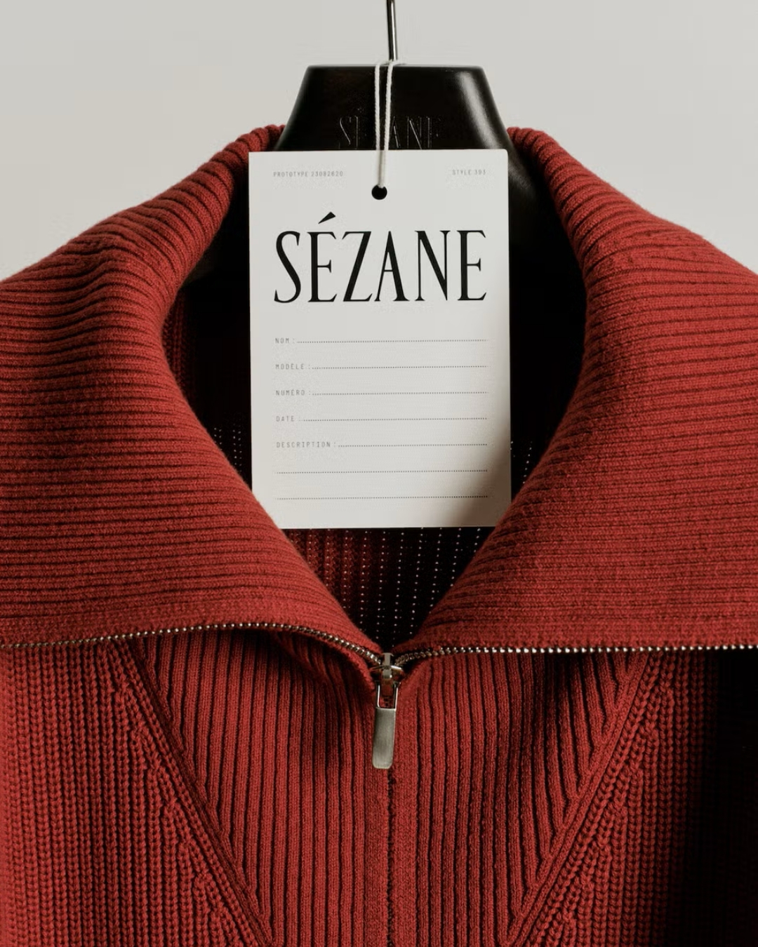
The wider changes help explain it. Sézane has introduced a new chapter with sharper styling and a stated intention to make more considered choices about its collections. The identity belongs to a wider presentation of the business, rather than existing as an isolated redesign exercise.
That matters because logos are often asked to explain more than they can. A different typeface can introduce a tone. It cannot establish whether a collection is better edited, whether a bag is easier to use or whether the service feels more considered. Those qualities have to appear elsewhere.
The before-and-after comparison makes the tonal decision clear. The old signature carried an impression of an individual hand. The new lettering is more regular and composed. Calling it a move towards generic minimalism would overlook the specificity of the serif treatment. It is restrained, but it is not a neutral sans-serif wordmark.
Greater formality changes the balance of the invitation. It can help a growing product world feel more composed, while also making an approachable brand seem further away. The surrounding experience needs to carry the warmth if the lettering no longer does. Styling, helpful information and small acts of service become especially valuable here.
The product gives that ambition somewhere practical to be judged. Think about reaching for keys with one hand, the way a bag stands or the shape it keeps. These are small observations, but they place a purchase inside someone’s day. A more considered presentation becomes persuasive when the object is considered in these ordinary ways too.
For a customer, that is useful information. A bag can be beautiful in a still life and irritating when it needs to be opened in a hurry. Explaining how it is meant to work gives the visual polish something to stand on. The promise becomes testable through use.
It also changes how maturity can be communicated. A brand does not have to become solemn to feel more developed. It can make better choices about what to offer, explain them clearly and remove inconveniences. The resulting experience may feel more assured even when the styling retains a sense of play.
The way the collection is introduced has a role as well. Giving customers time to examine a smaller edit could make the offer easier to understand. Whether a slower rhythm feels more considered will depend on the distinctiveness and usefulness of the pieces, rather than the language used to announce them.
For existing buyers, continuity will probably be evaluated through familiar details. A shape they return to, a way of styling clothes or a helpful piece of product information can do more to reassure them than an explanation of the new wordmark. They do not need every surface to remain unchanged in order to recognise the brand.
New customers have a different task. They encounter the current identity without having to reconcile it with a remembered version. For them, the question is whether the presentation and the products make sense together. A redesign that generates disagreement among long-standing followers may still make the offer clearer to someone arriving for the first time.
The case is most interesting when we resist making the logo carry the verdict. The identity tells us how Sézane wants to present this chapter. The range, the practical product details and the experience of buying will tell us how thoroughly that chapter has been developed.
There is a simple way to judge the relationship between them. If the new presentation promises more consideration, the customer should be able to find that consideration somewhere ordinary: in the bag she opens, the information she needs or the garment she keeps reaching for. That is where a visual change becomes a change worth noticing.


.svg)


.svg)
.svg)