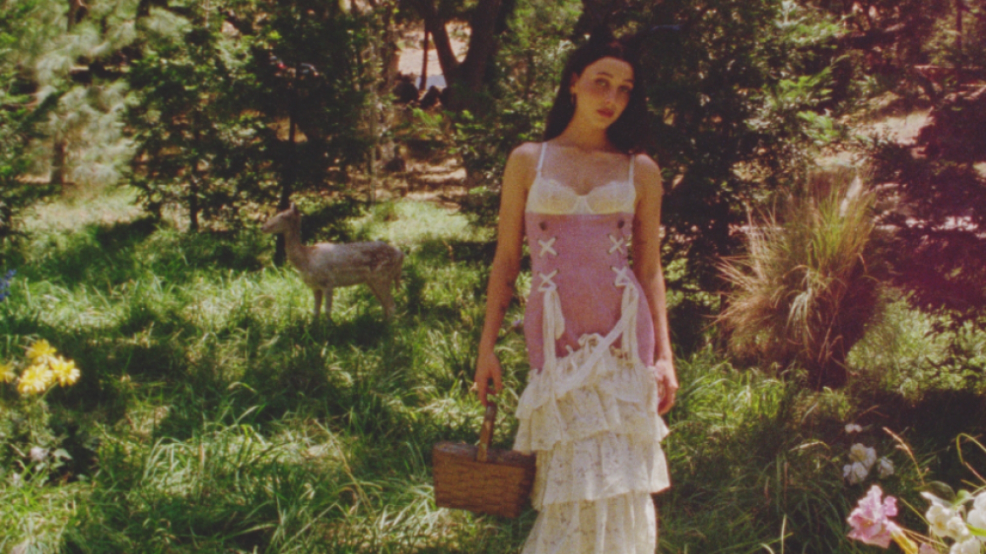
The offer includes an almond-flavoured blend, blueberry syrup, a mug and a picnic blanket. The campaign places Emma Chamberlain in a woodland world, with soft clothing, animals and dappled light doing much of the atmospheric work. It is an unusually elaborate setting for a drink that may ultimately be made beside someone’s kettle.
That distance between the image and the kitchen is part of the interest. The collection gives customers a manageable piece of the scene. They do not need a woodland location to try the coffee, and the syrup offers another small way to change an existing routine. The fantasy is large; the action required can be quite ordinary.
For Pinterest, the collaboration makes a trend forecast tangible. A named aesthetic can be difficult to assess when it is expressed only through a mood board. A product requires more decisions. What does the idea taste like? Which object belongs with it? How much of the reference should remain visible once someone is using it?
For Chamberlain Coffee, an existing ritual provides a natural place to put those decisions. Coffee already has a relationship with mornings, breaks and the small arrangements people make around them. The collaboration can introduce novelty without requiring the customer to learn an unfamiliar category.
The choice of accessories extends the setting around the drink. A mug makes the idea visible during use. A blanket moves the imagined occasion outdoors. Together, they suggest how the customer might spend time, rather than only what they might consume. The products give the campaign somewhere to go once the photograph has done its work.
The woodland styling has an element of fantasy and play. It puts the products into an imagined afternoon, with enough detail to make the occasion feel recognisable. A mug on a plain background tells us what is for sale. The same mug within this scene suggests when we might want to use it and what we might enjoy about that moment.
There is a similar distinction with the trend itself. Pinterest’s search behaviour can help the company identify patterns within its platform. Turning one of those patterns into a collaboration is a creative and commercial decision. It does not establish that every coffee customer wants the same aesthetic, or that a popular search will necessarily become a purchase.
The interesting part is the translation. A weak version would put a trend name on packaging and stop there. Here, the flavour choices, the useful objects and the campaign setting offer several points of connection. A customer can respond to the taste, enjoy the imagery or be drawn to the occasion the collection suggests.
That flexibility may matter more than perfect agreement with the forecast. People rarely buy a product solely to demonstrate that they understand a platform’s trend report. They need something about the offer to fit their own preferences. The collaboration works as an idea when the aesthetic helps the product feel appealing without becoming a test the customer has to pass.
The next test belongs to ordinary use. The flavour needs to earn a second cup, and the accessories need to be useful once they leave the photograph. A picnic blanket that finds its way onto an actual outing has taken the idea further than another saved image. That is where a collaboration can become part of a routine.
What the collection already shows is a useful route from visual inspiration to a concrete offer. The coffee gives the fantasy a taste. The objects give it a place in a routine. The strongest version of that relationship would let someone keep enjoying the products long after they have forgotten the name of the trend that brought them together.




.svg)


.svg)
.svg)